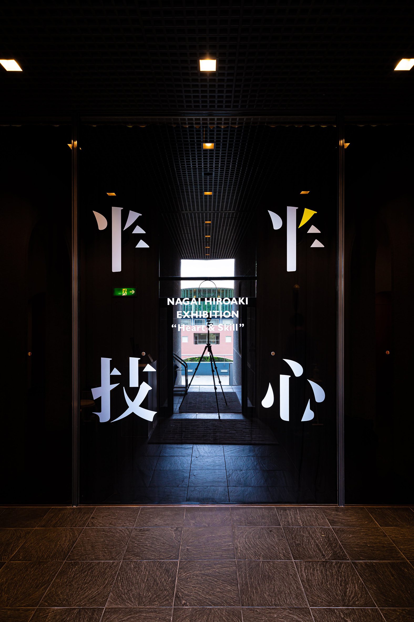
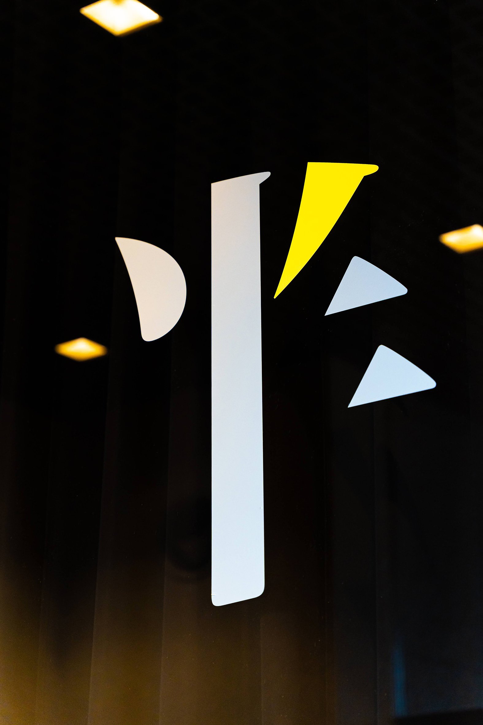
NAGAI HIROAKI EXHIBITION
“Heart & Skill”
@Tokyo Zokei University Art Museum
永井裕明 退職記念展 “半心半技”
東京造形大学附属美術館
2022.9/1(thu)-10/3(mon)
https://www.zokei.ac.jp/news/2022/17049/
https://zoomedia.sakura.ne.jp/project/2022nagaiten/index.html
Venue: Tokyo Zokei University Art Museum
Type: Exhibition
Exhibition Period: 2022.9.1 - 10.3
Client: Hiroaki Nagai (Art director, N.G inc.)
Exhibition design: Mariko Abe
Organized by: Tokyo Zokei Univ. (Hidemi Monma)
Fixture manufacture: Junichiro Kazama
Poster paneling and installation: Frameman
Installing support: Tokyo Zokei Univ. students
*Photography: Yohei Yamakami 山上洋平
NAGAI HIROAKI EXHIBITION
“Heart & Skill”
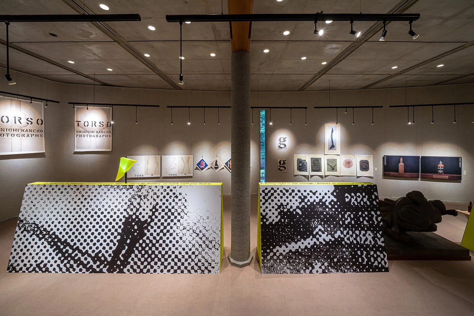
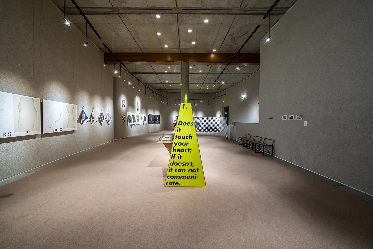
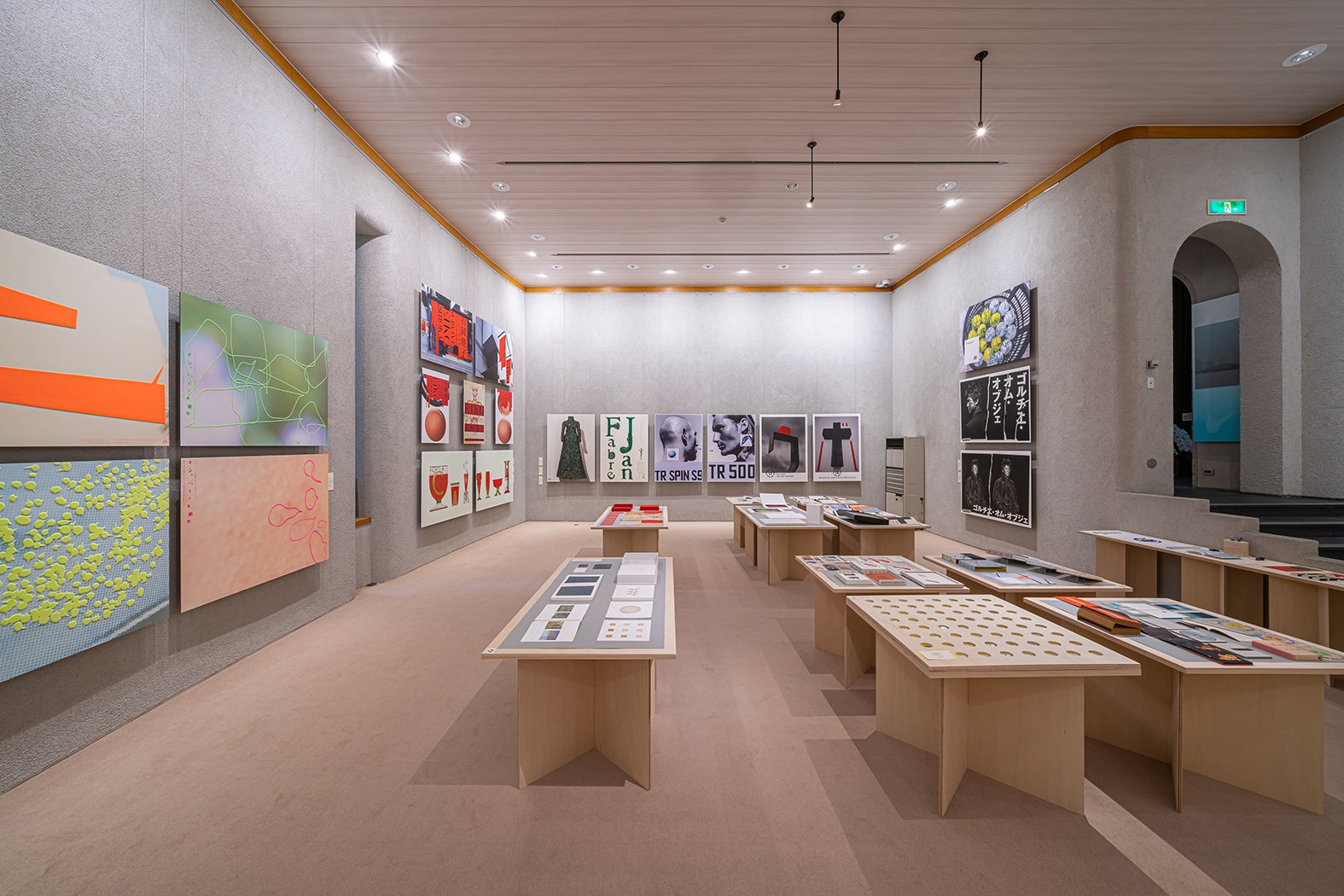
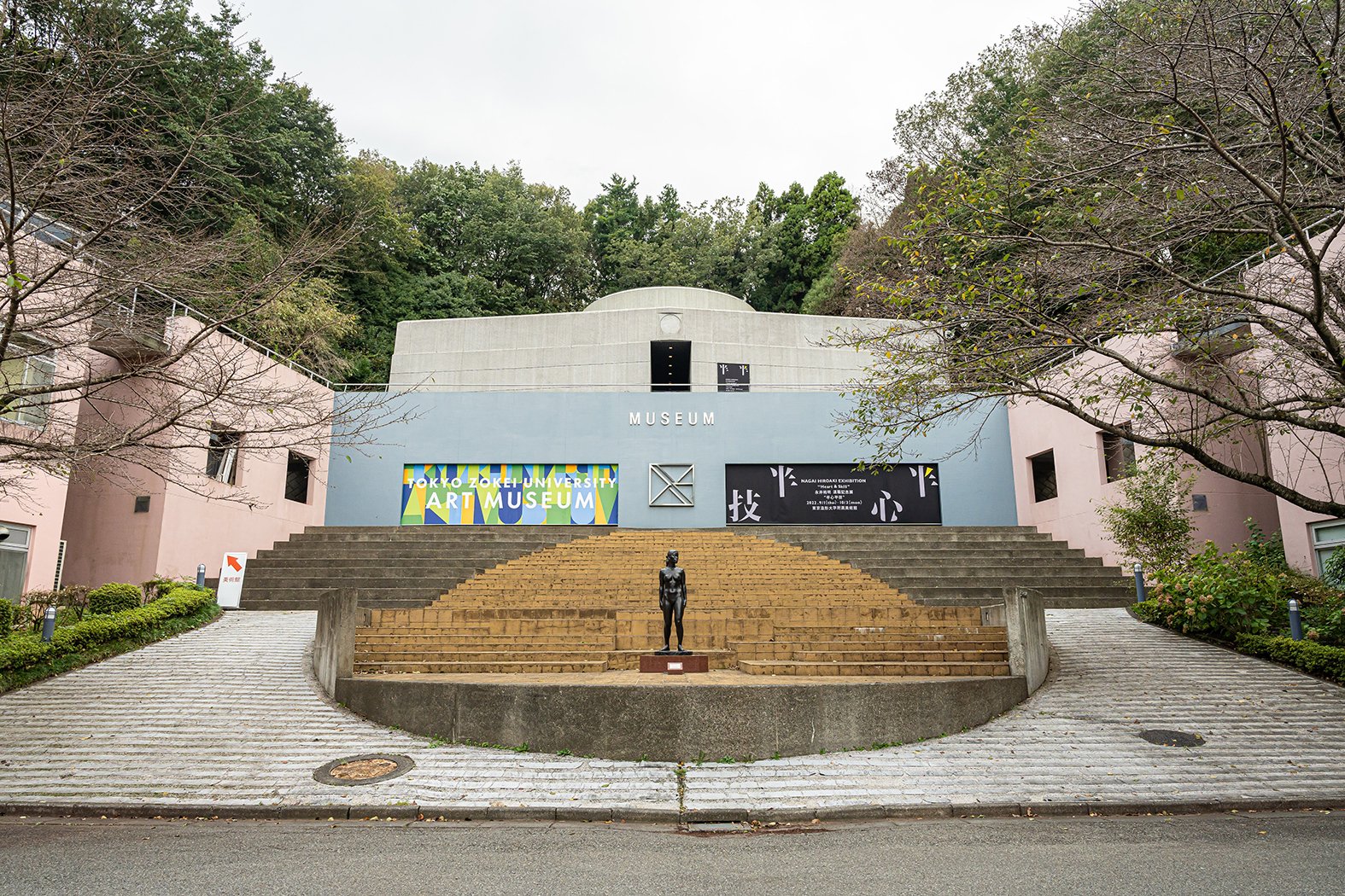
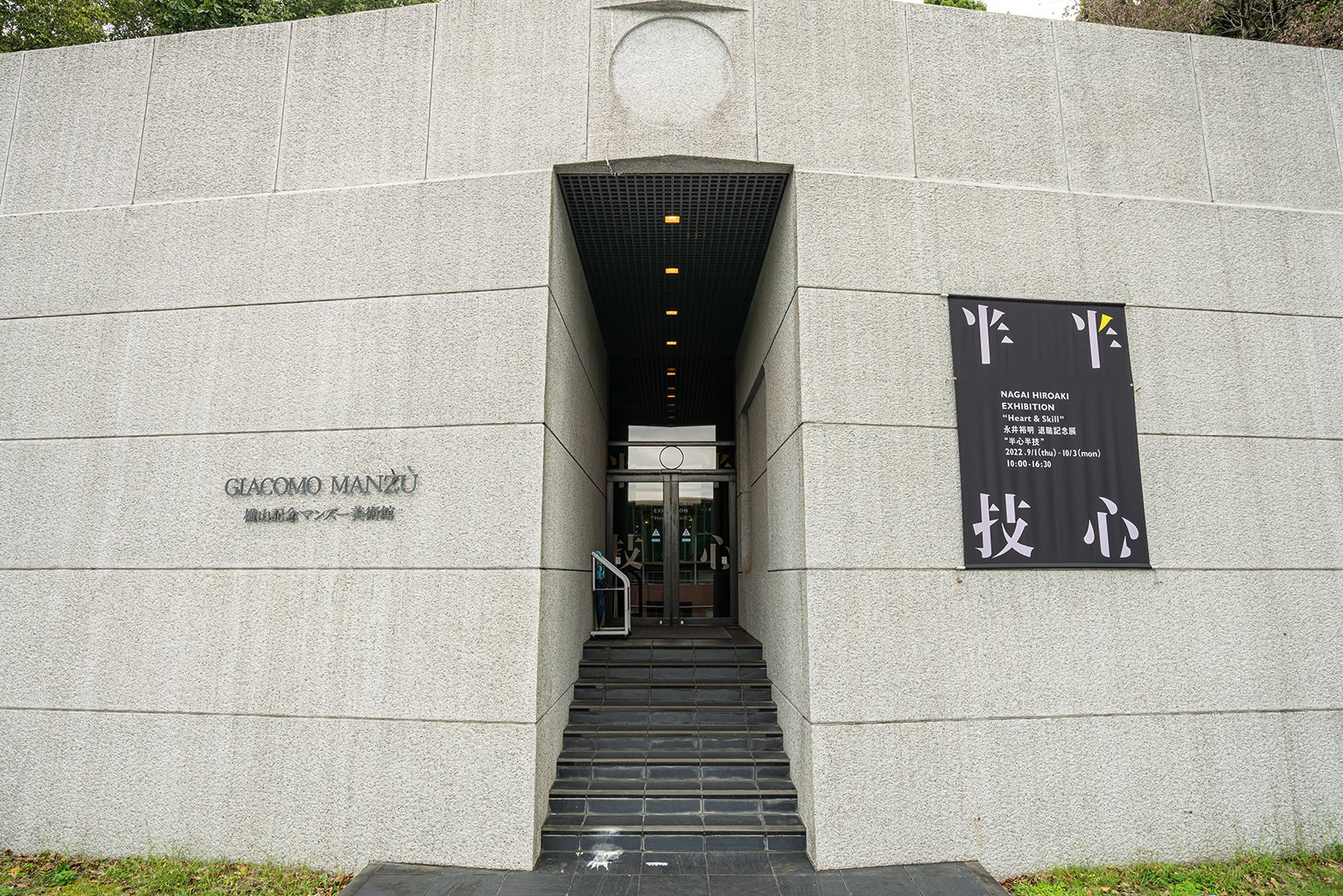
The exhibition design for the art director Hiroaki Nagai. Originally designed by Seiichi Shirai, the venue, Tokyo Zokei University Art Museum stands symbolically on top of a mountain on the University Hachioji Campus surrounded by nature.
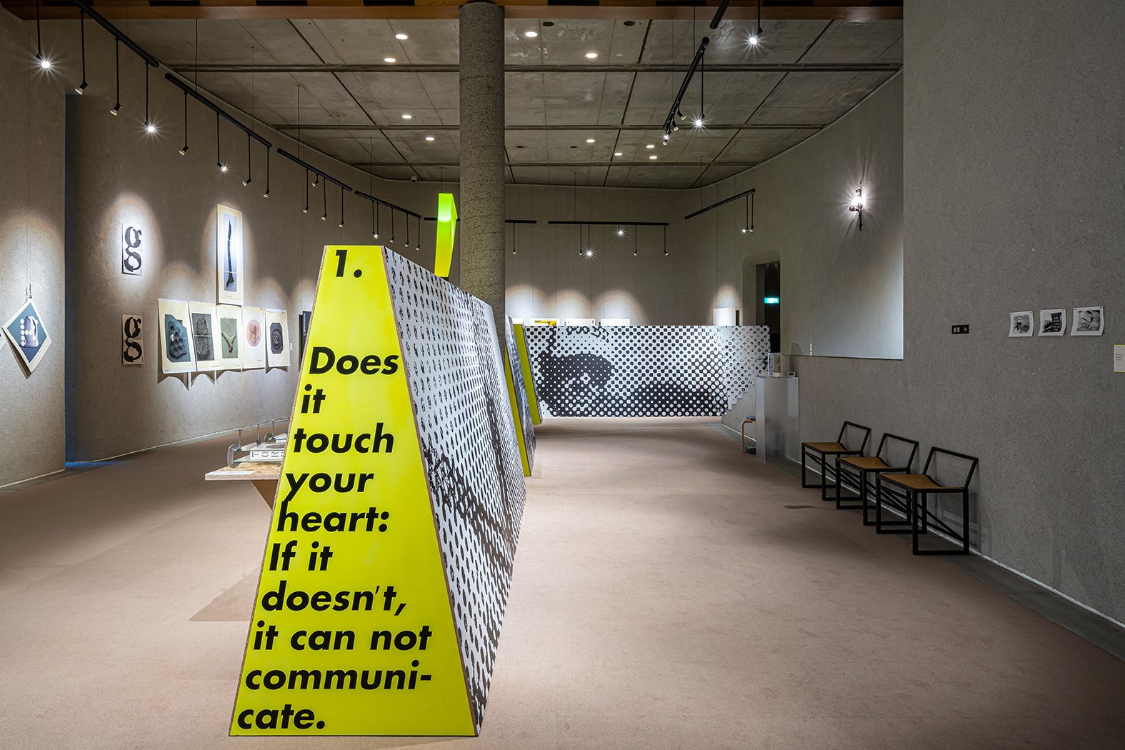
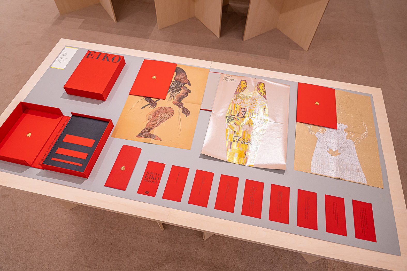
It was a real pleasure for me to collaborate with Nagai two years prior to this for the Eiko Ishioka Exhibition. His attitude towards design inspired me a lot since then, having ideas from every possible angle, testing in real scale, but not being afraid to take the extra jump/fun. The curiosity, and instinct to find something "touch your heart" is extraordinary, as listed in the seven philosophies on the top page of his HP.
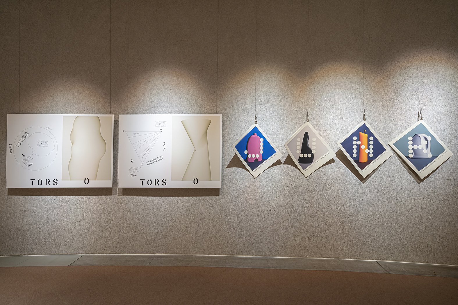
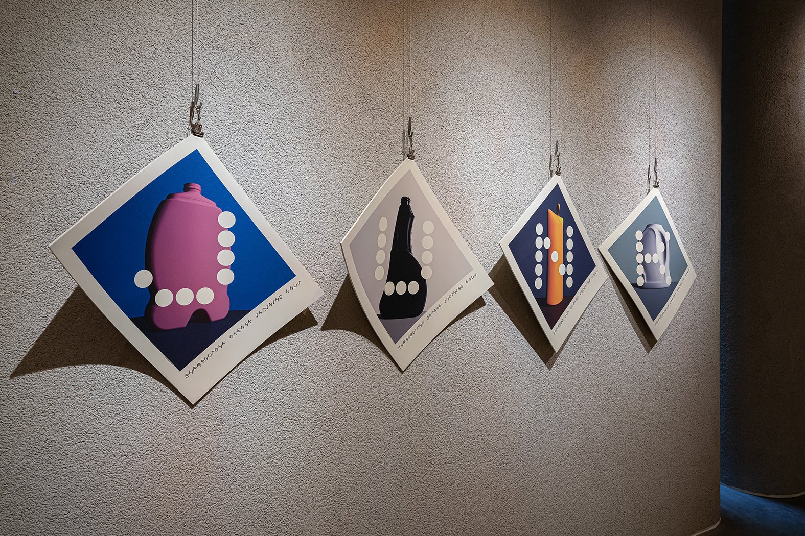
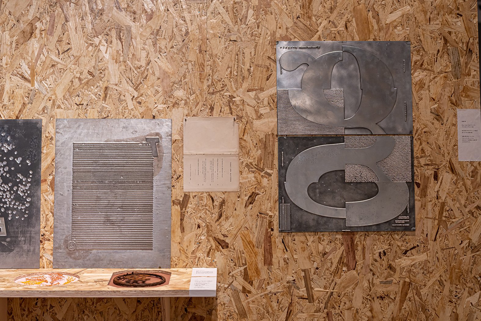
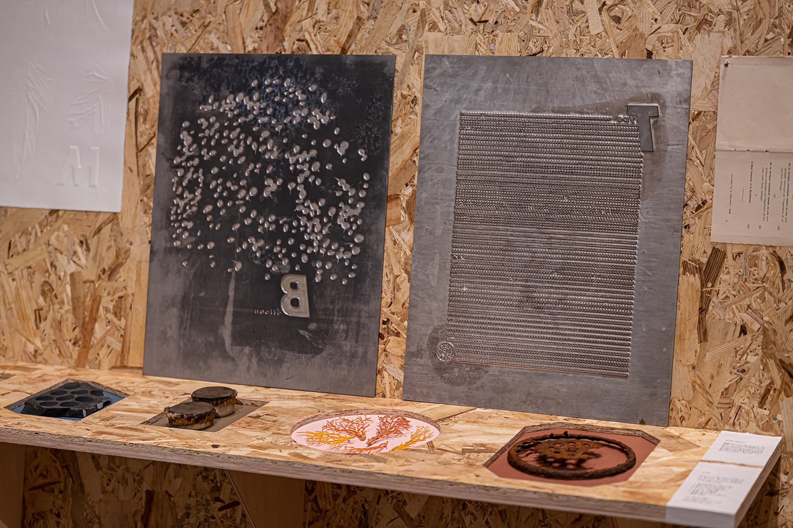
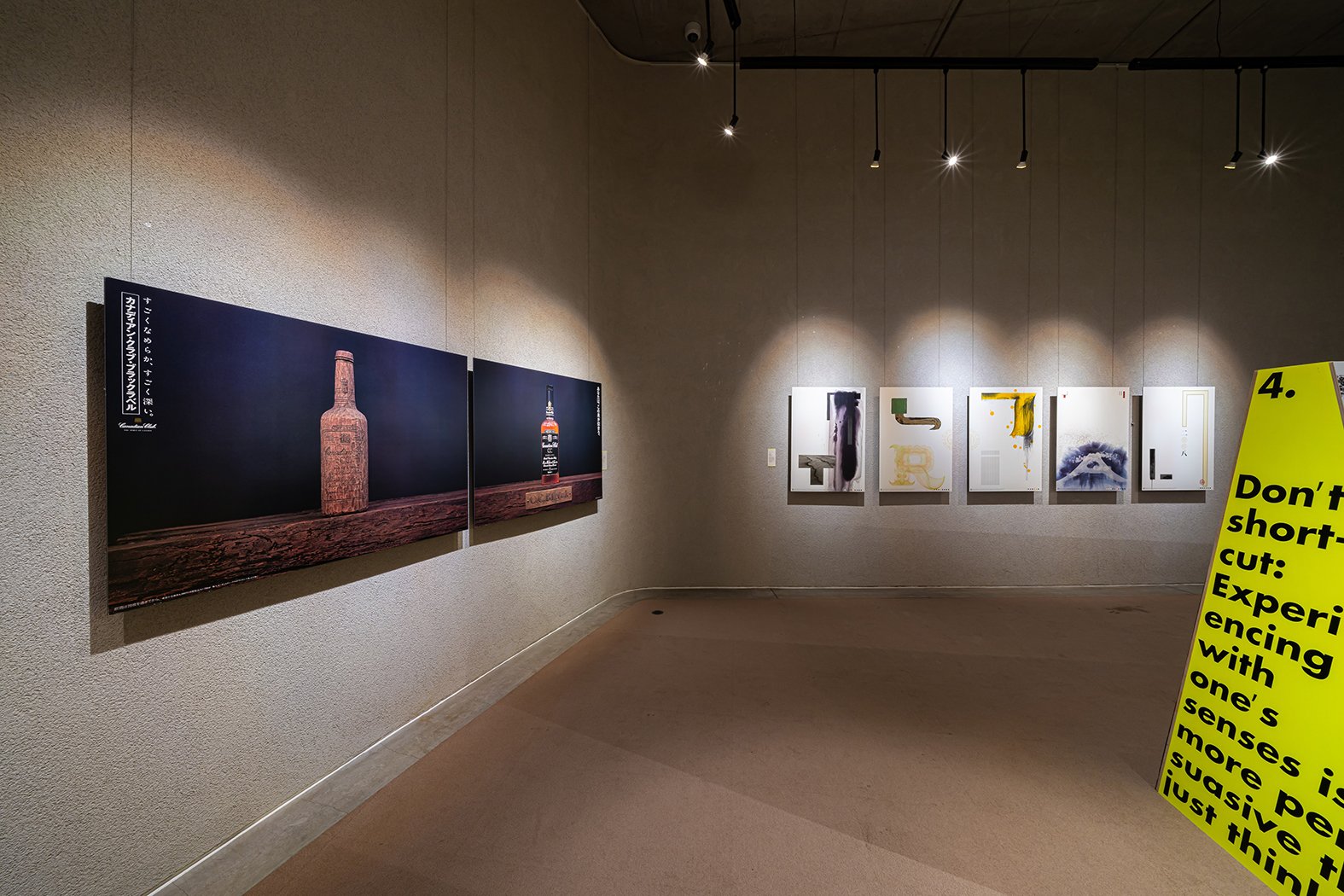
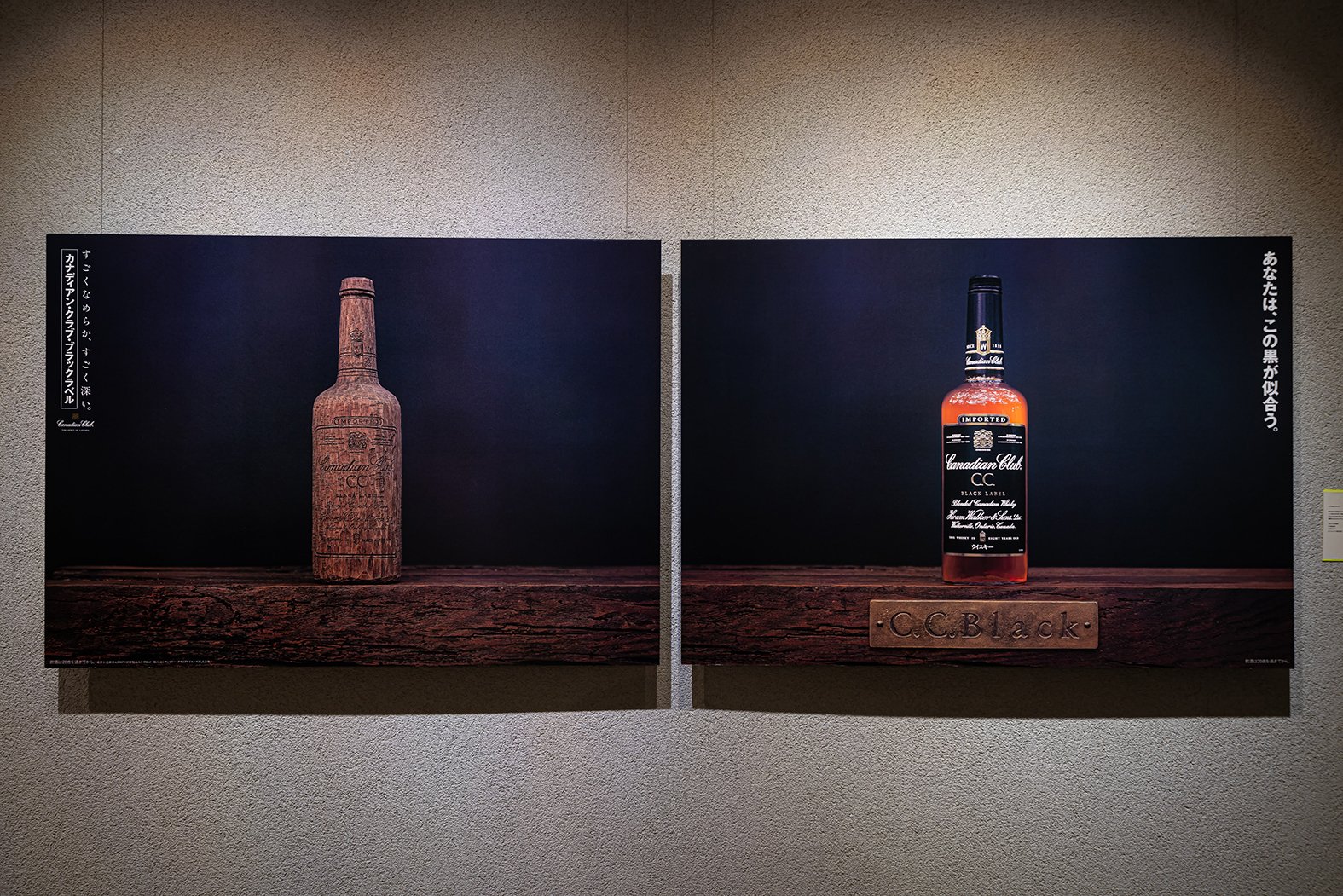
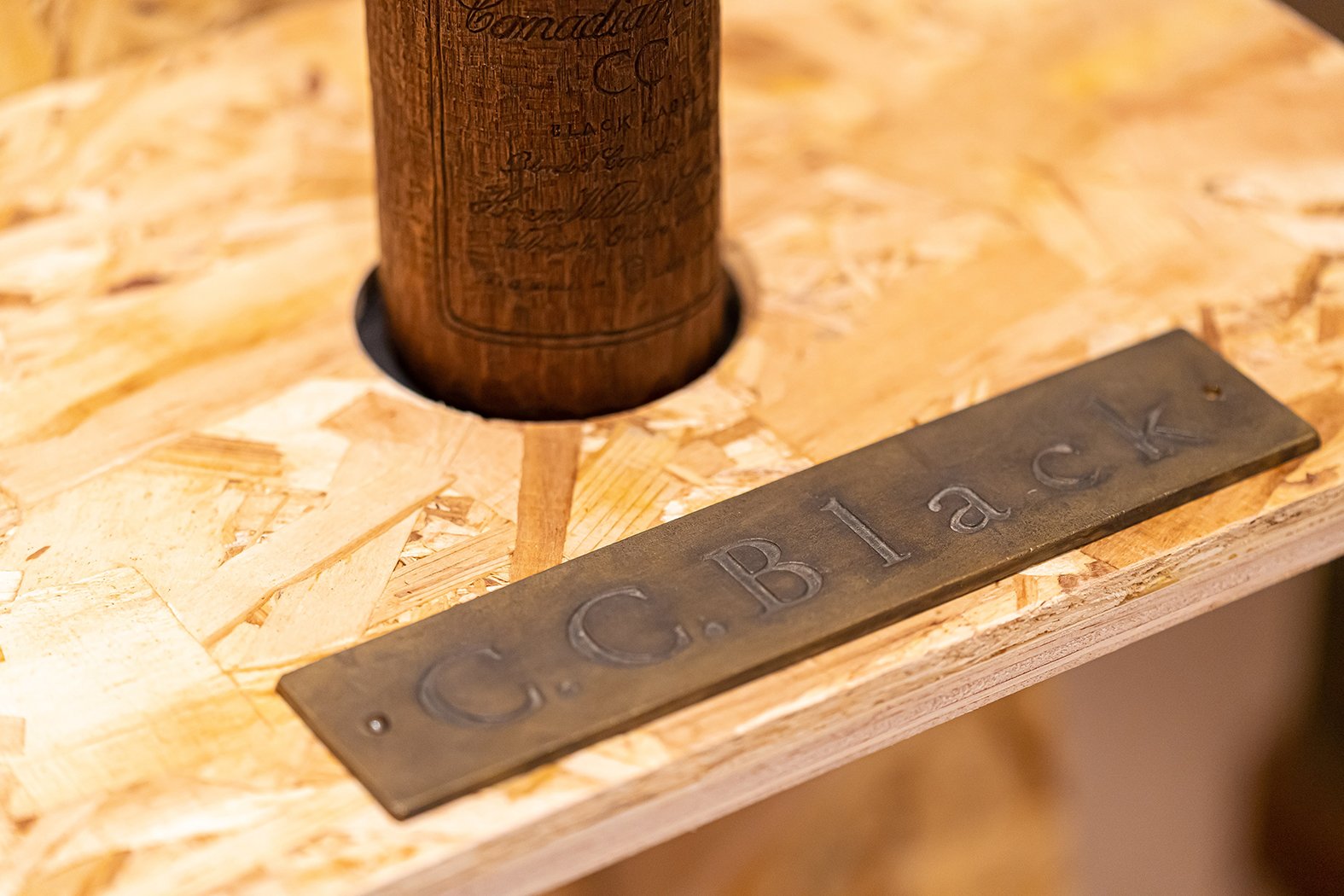
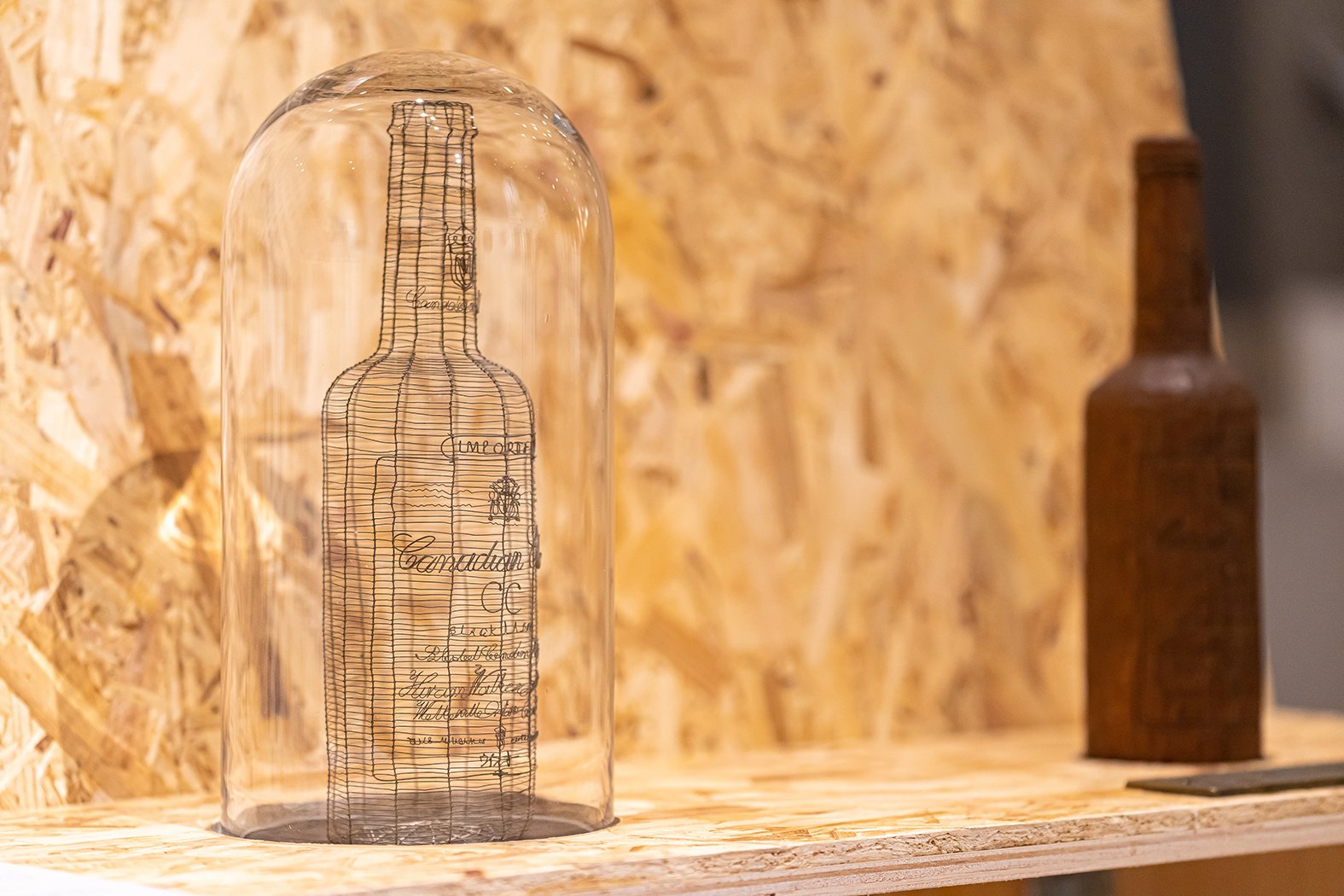
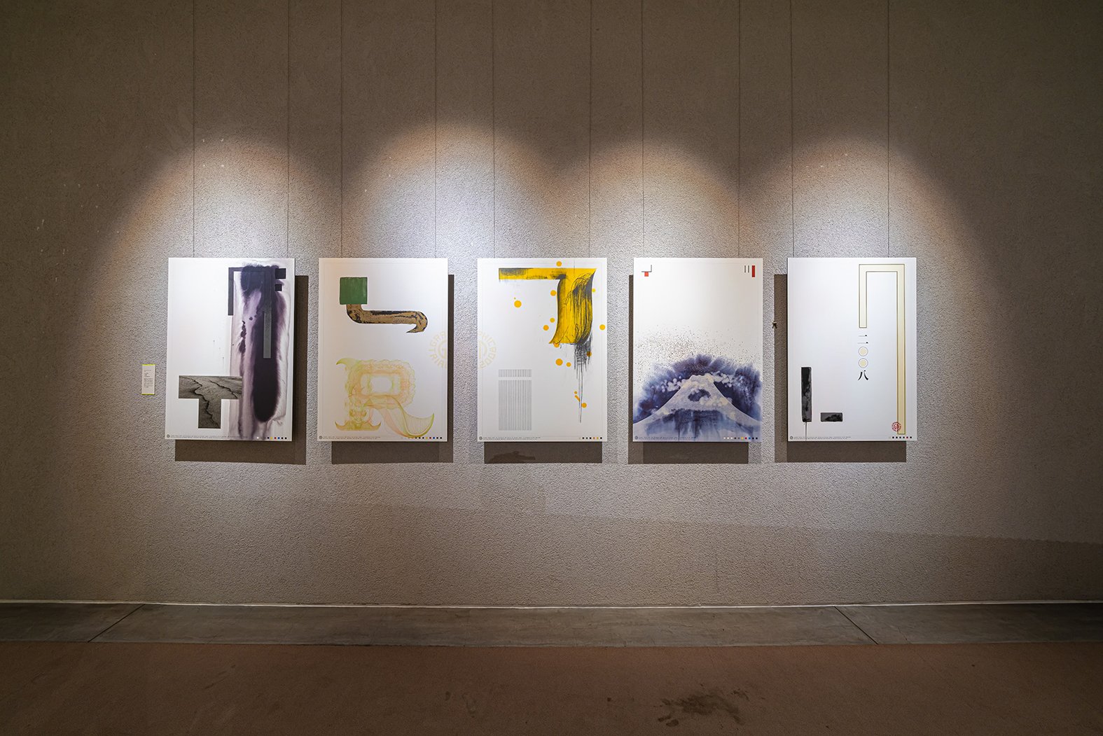
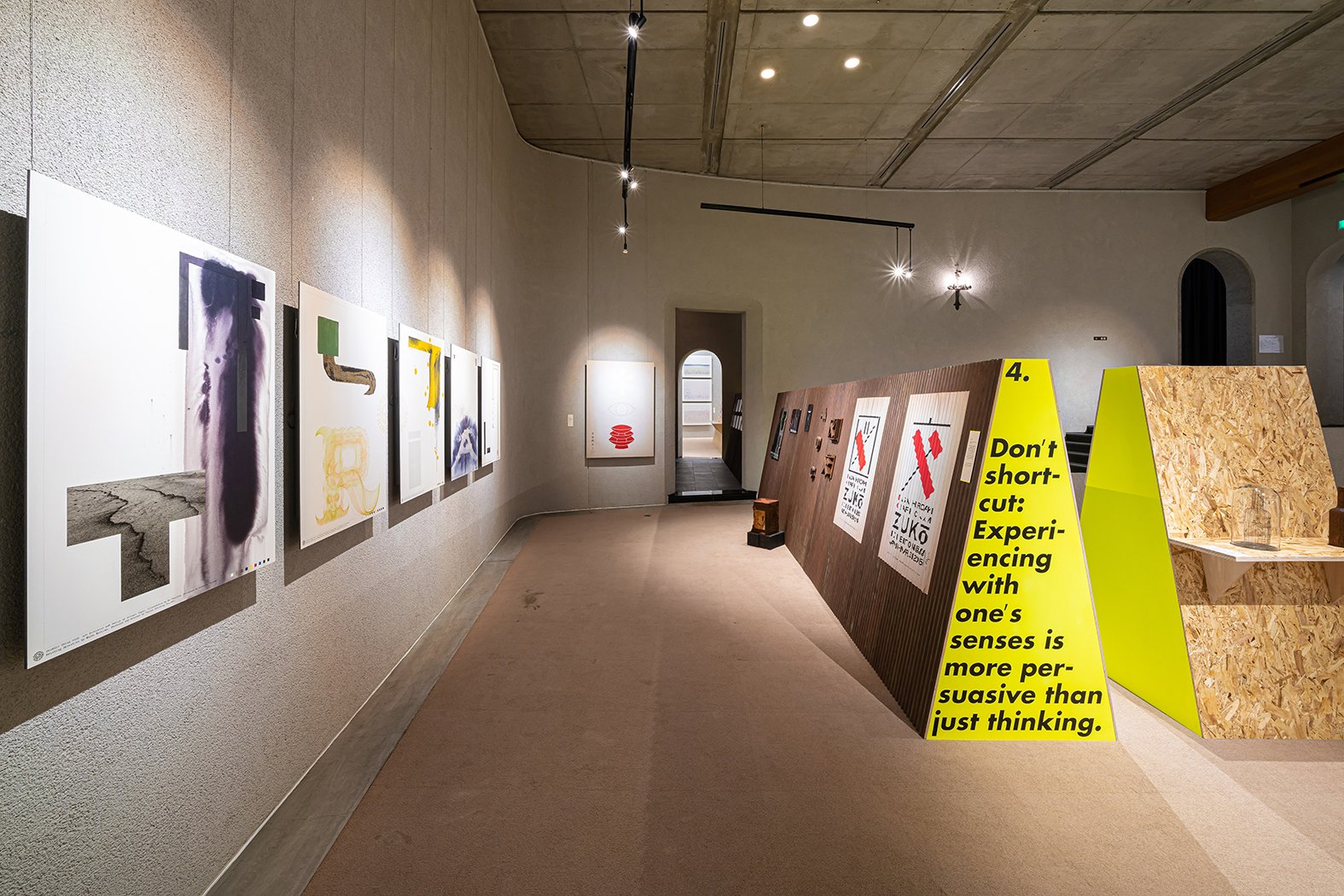
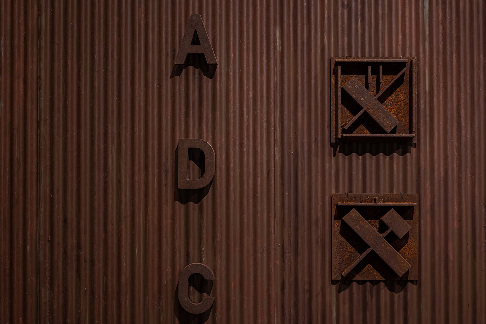
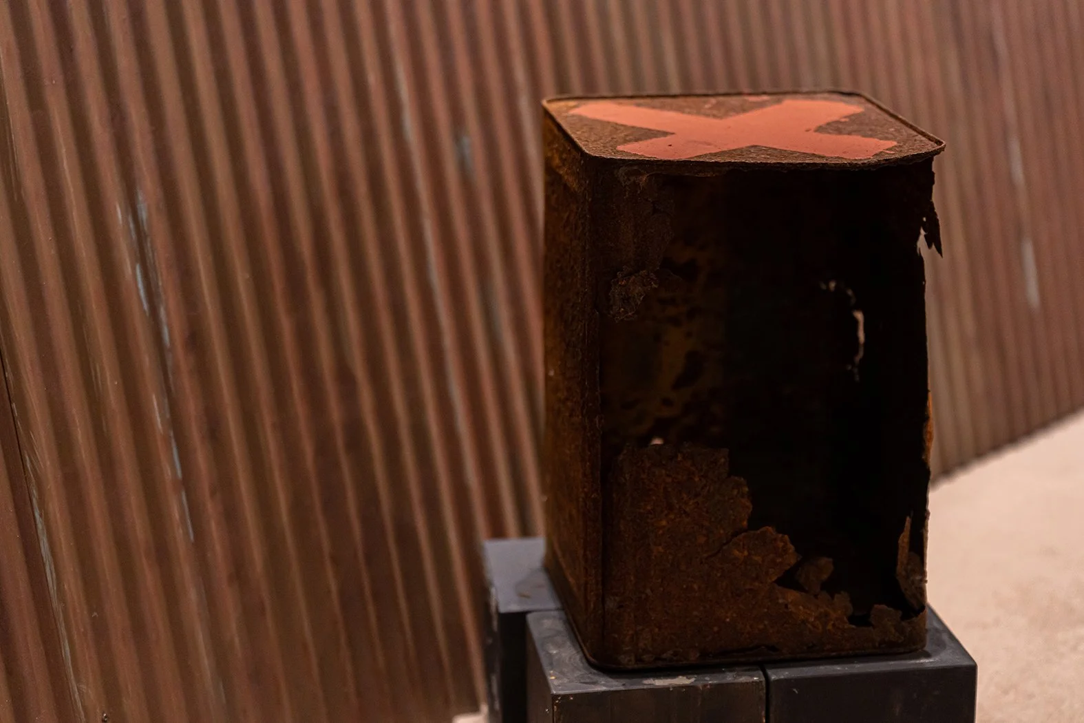
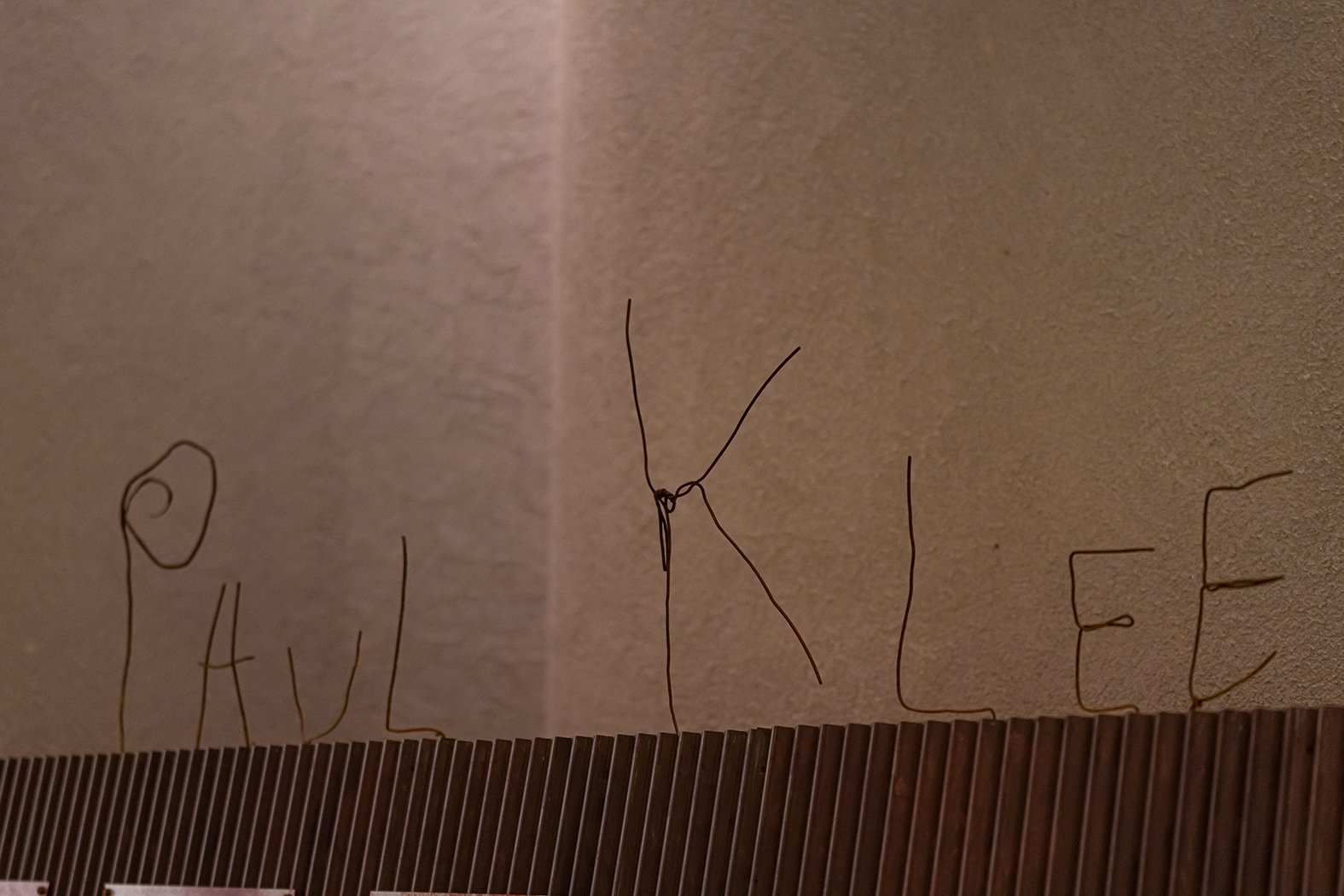
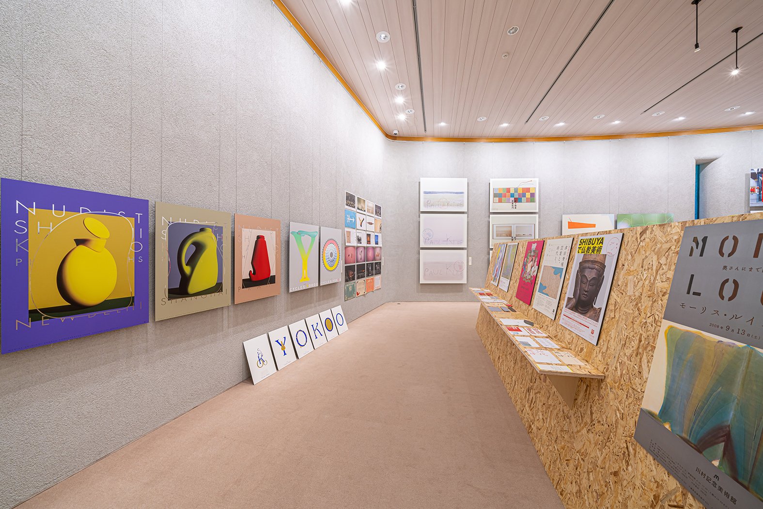
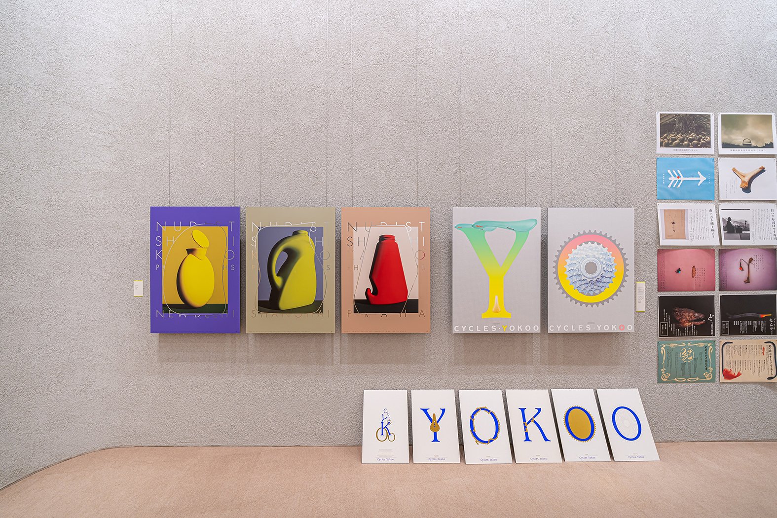
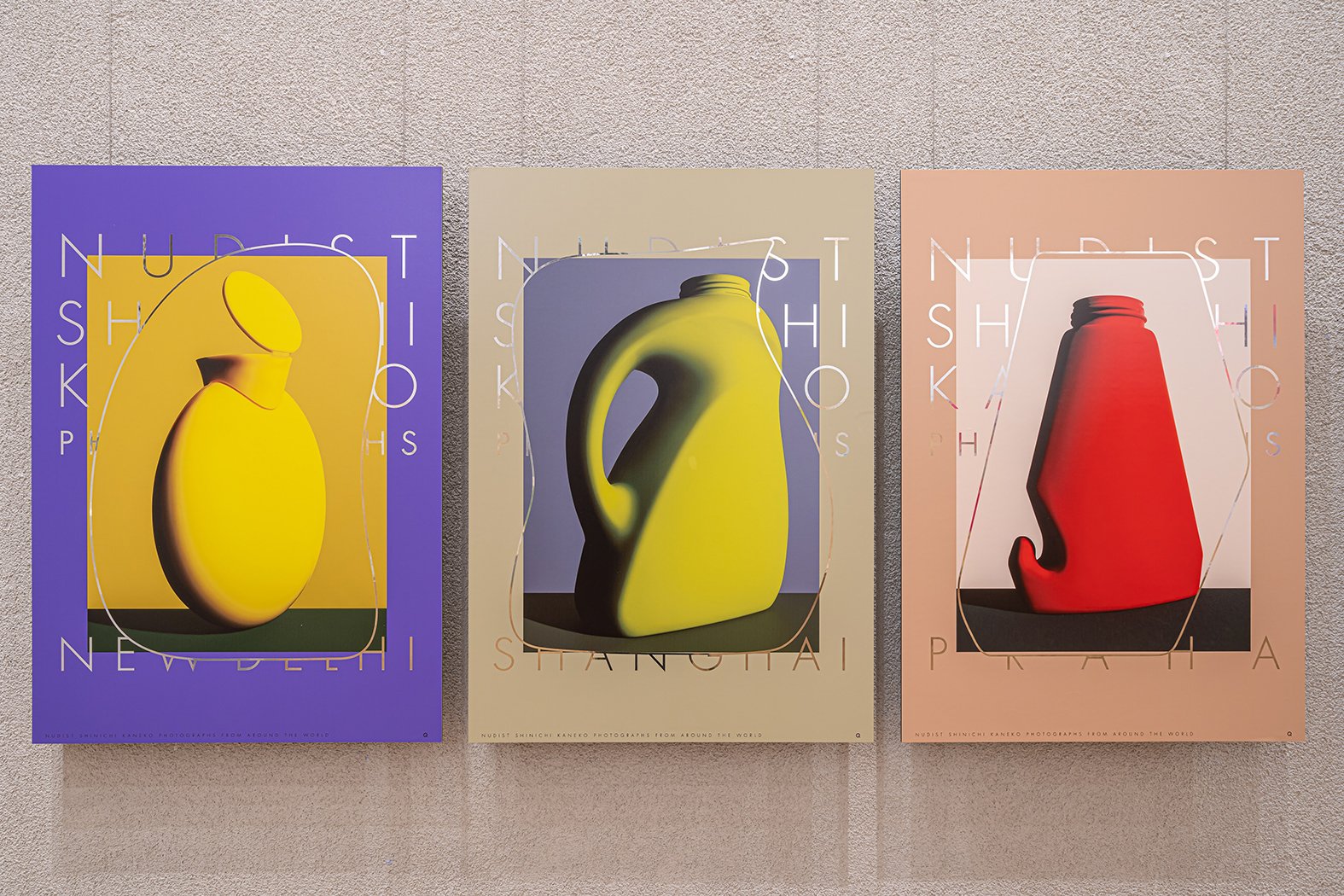
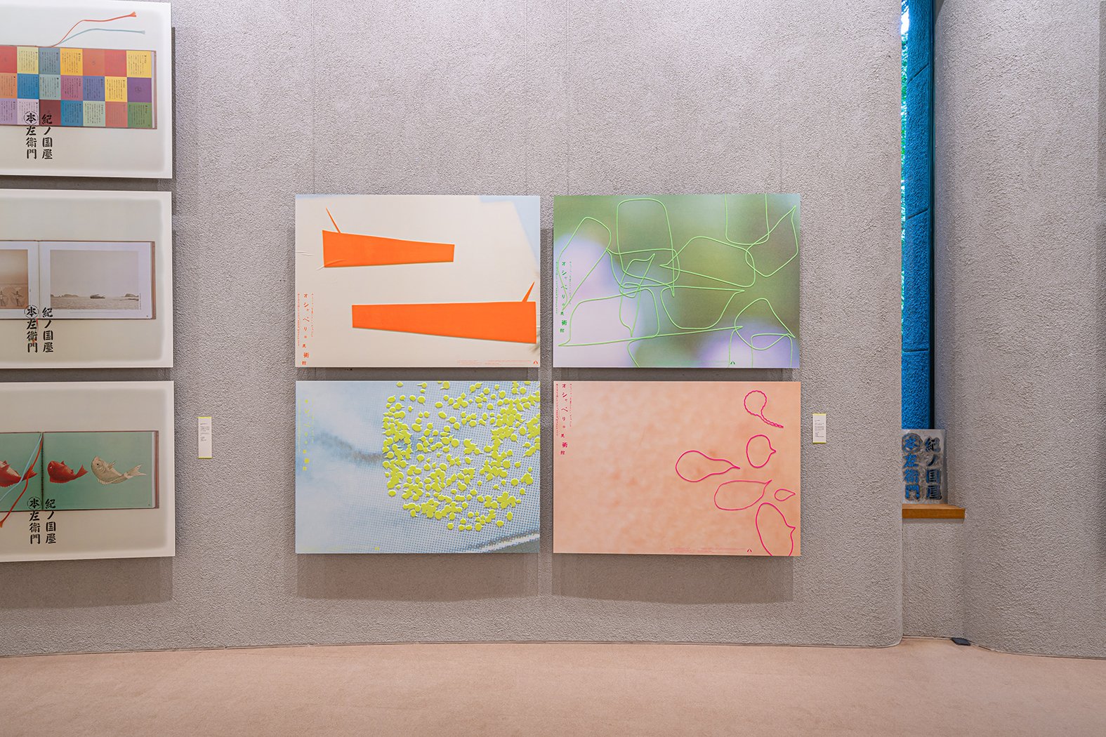
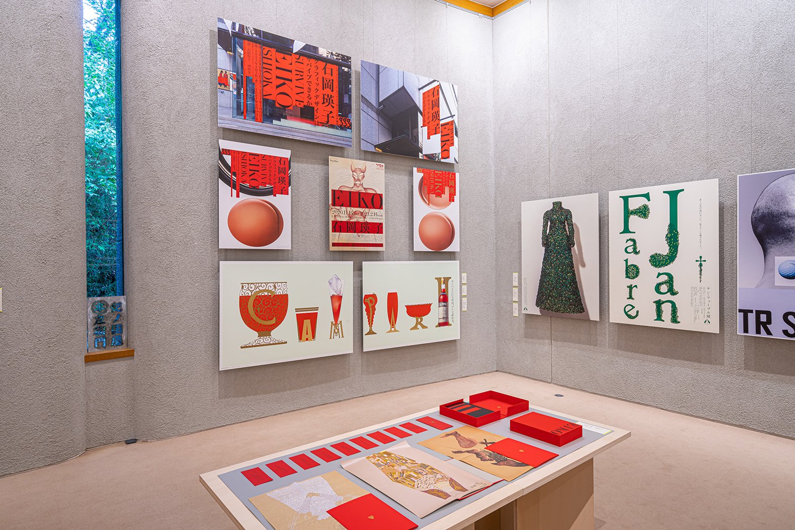
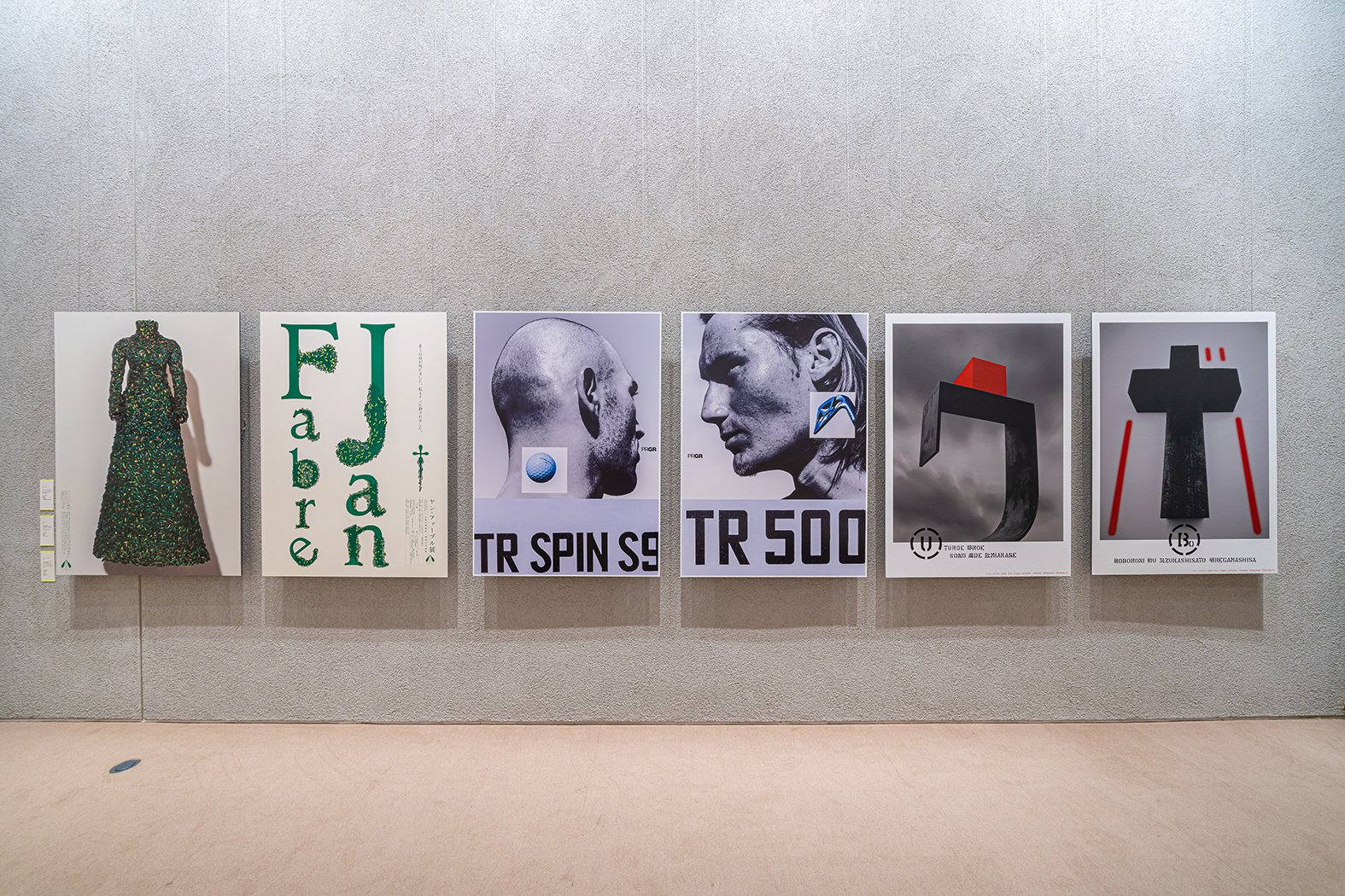
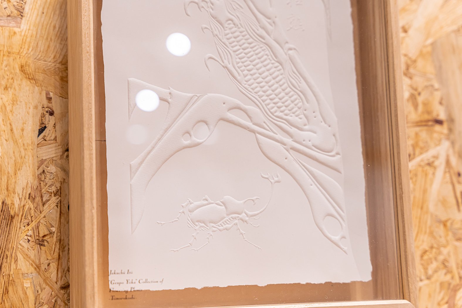
Gravity, attraction, and texture were the themes that came to my mind when I started designing. There are various textures that appear in his works (ex, natural light, stencils, wire, sandy beach, hand-drawn lines, canvas, rust, and puns) that have a haptic sense even though they are printed on the surface. It even makes you imagine the production process and the energy around at that time.
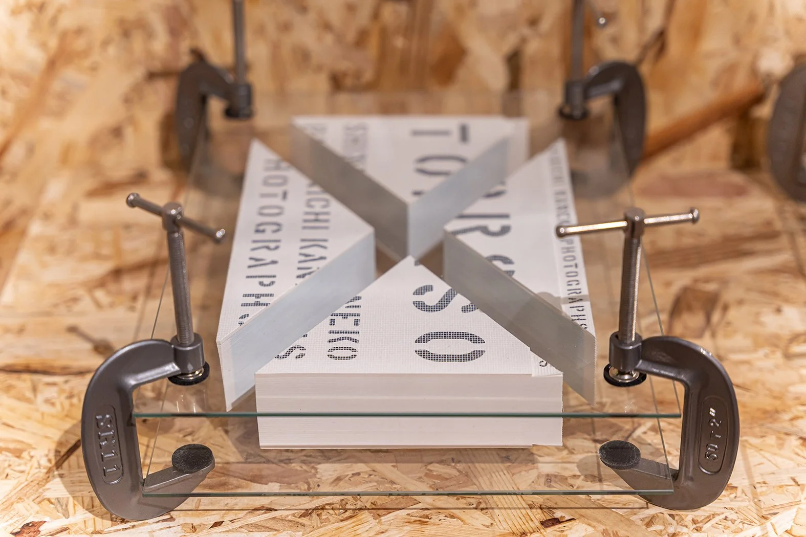
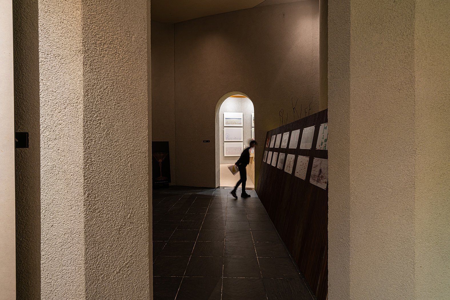
The theme of gravity kept us questioning every scale. If you "place" something, is it to be laid down, stand it upright, or dropped? When you "hang" something, is it to be floated, pasted, where, how, with which part, or need a hook? We looked for all sorts of hints. Since the venue is an art university, we tried to incorporate a feeling of production and experimentation, which can flip the silent and classical atmosphere of the museum building.
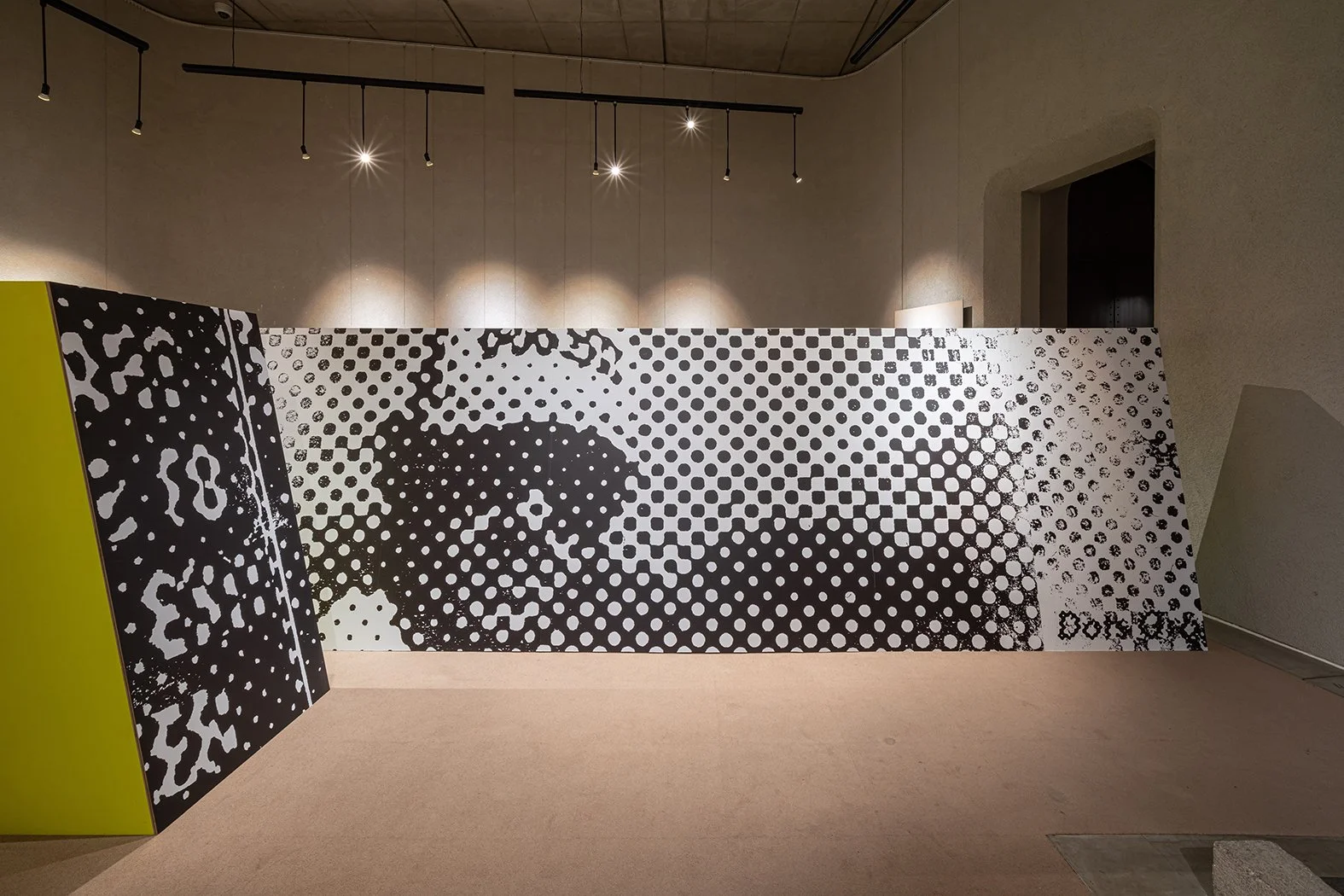
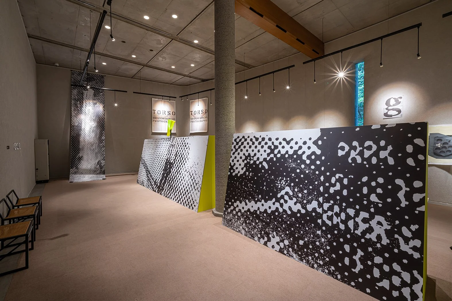
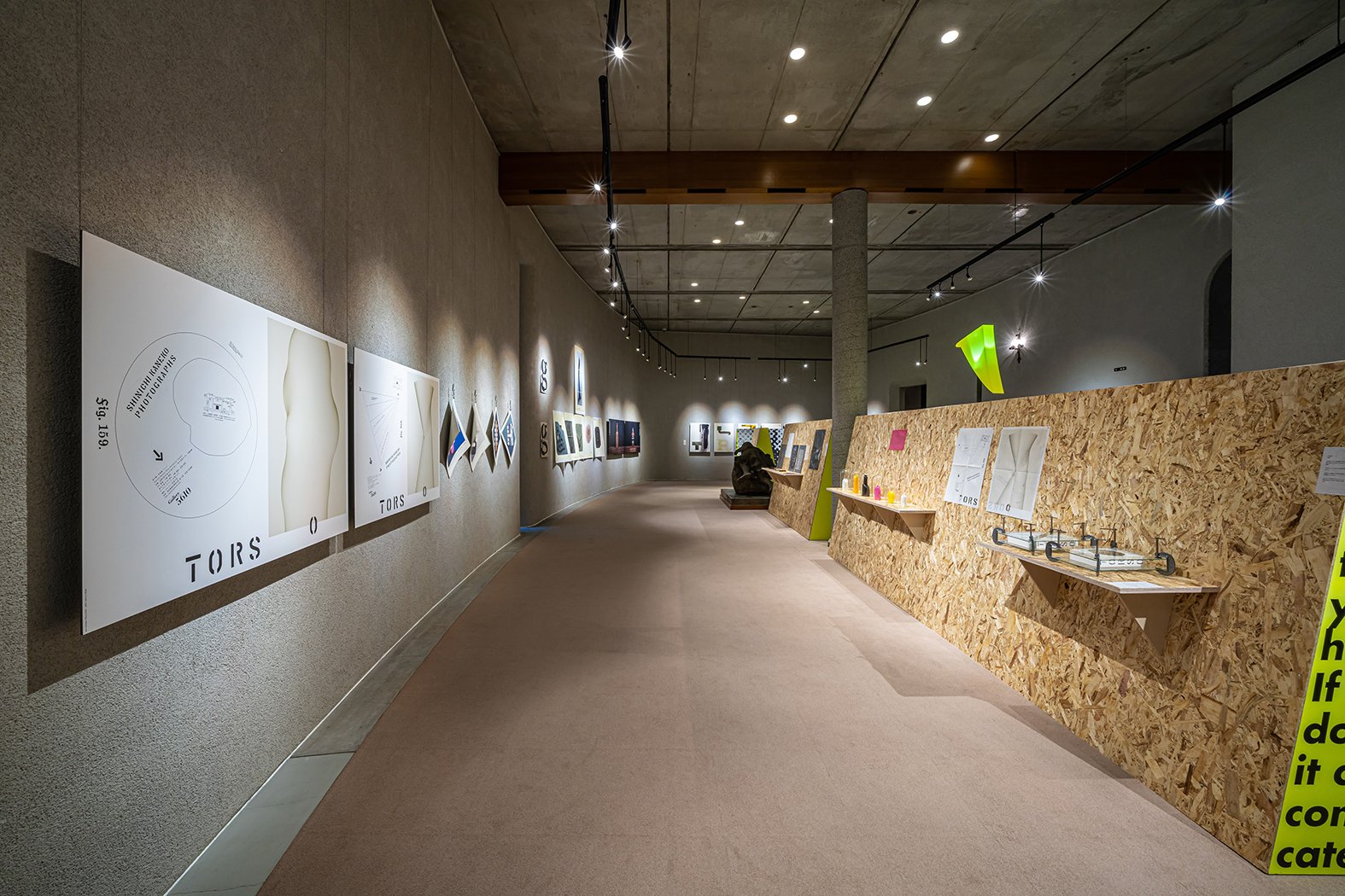
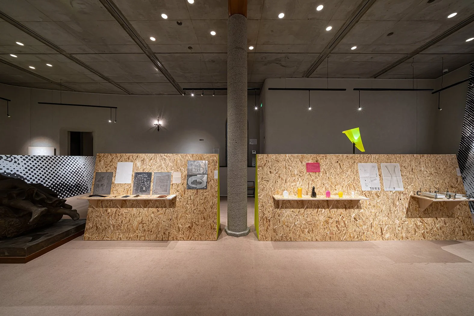
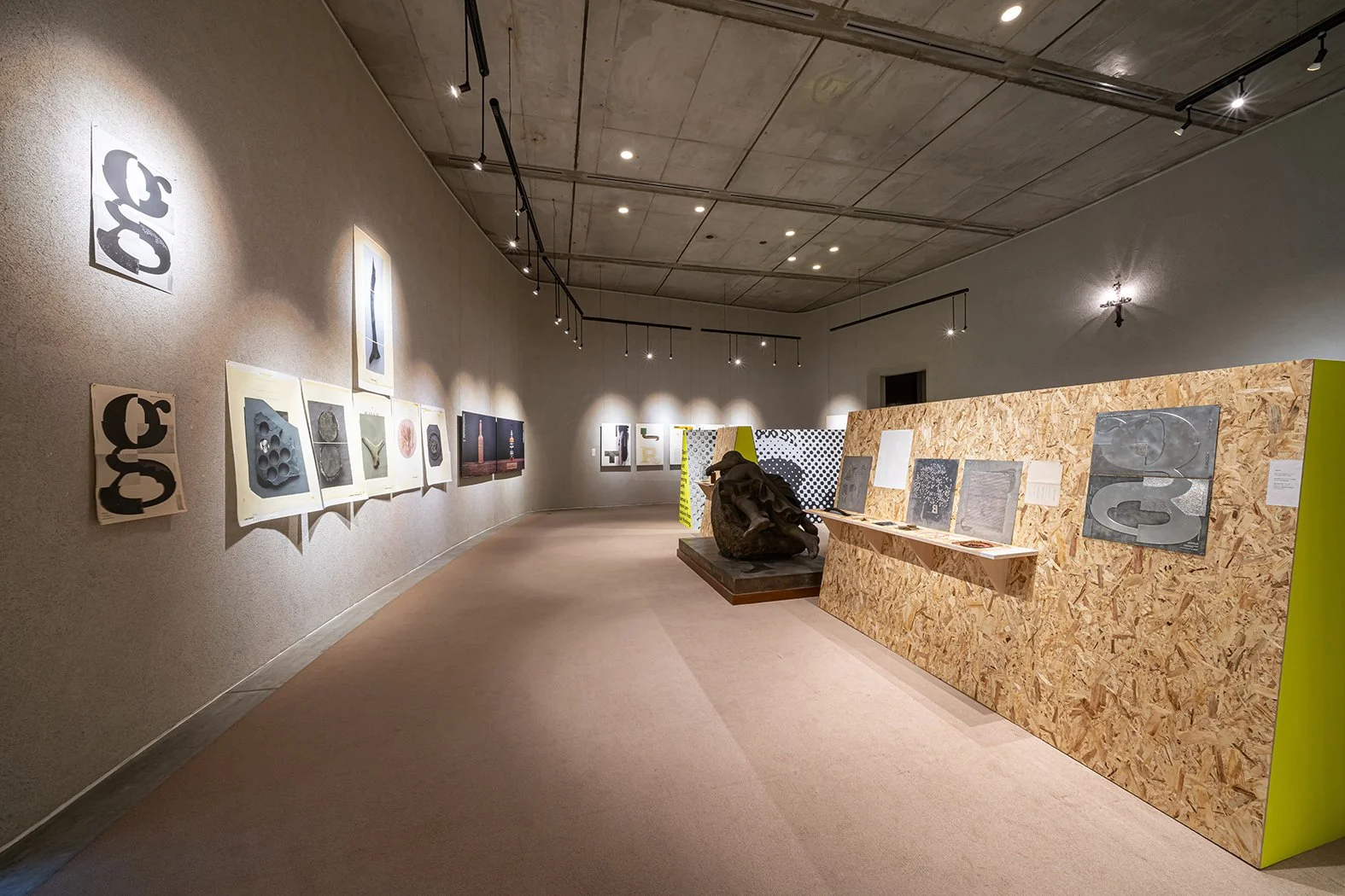
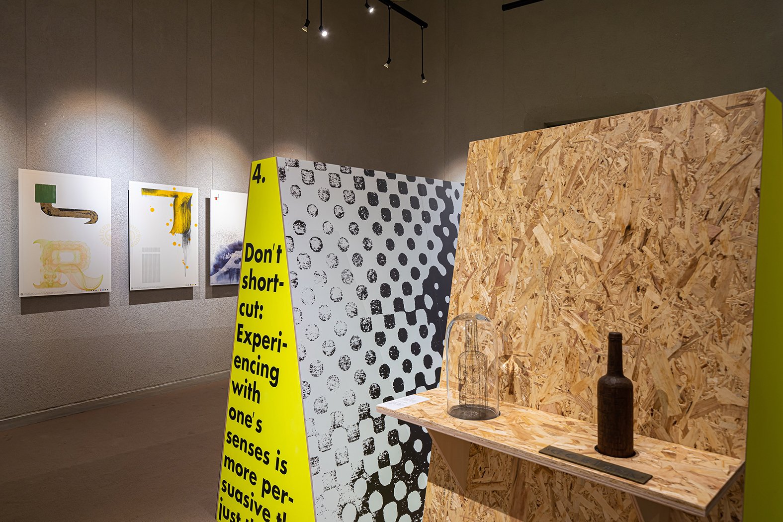
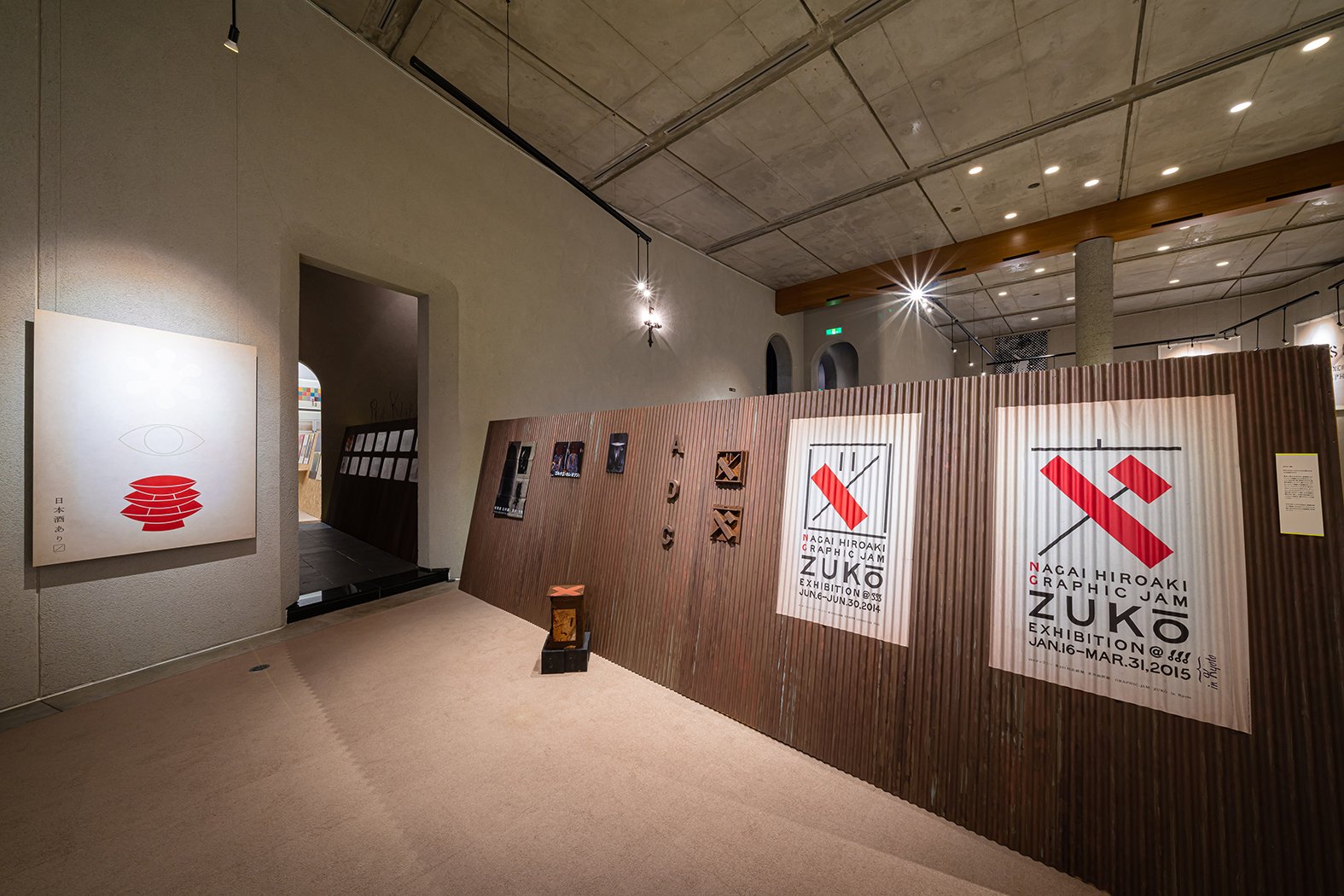
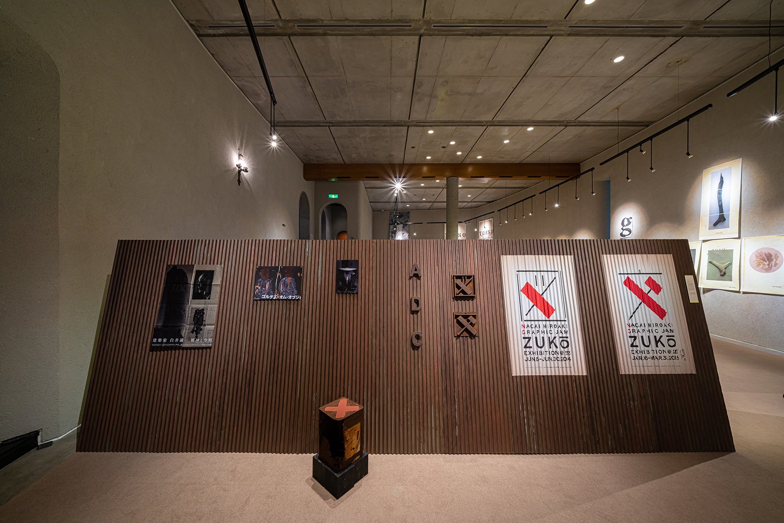
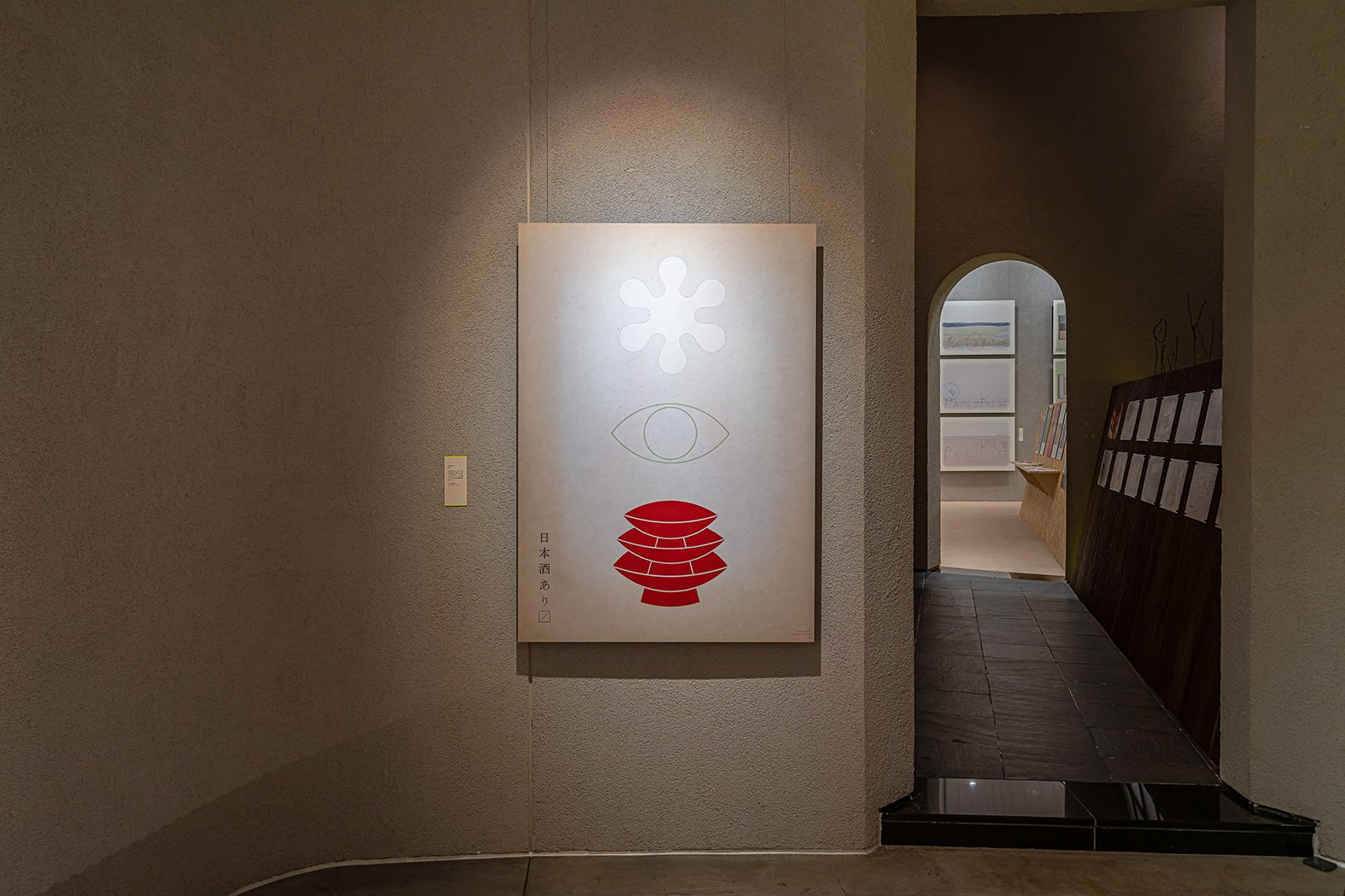
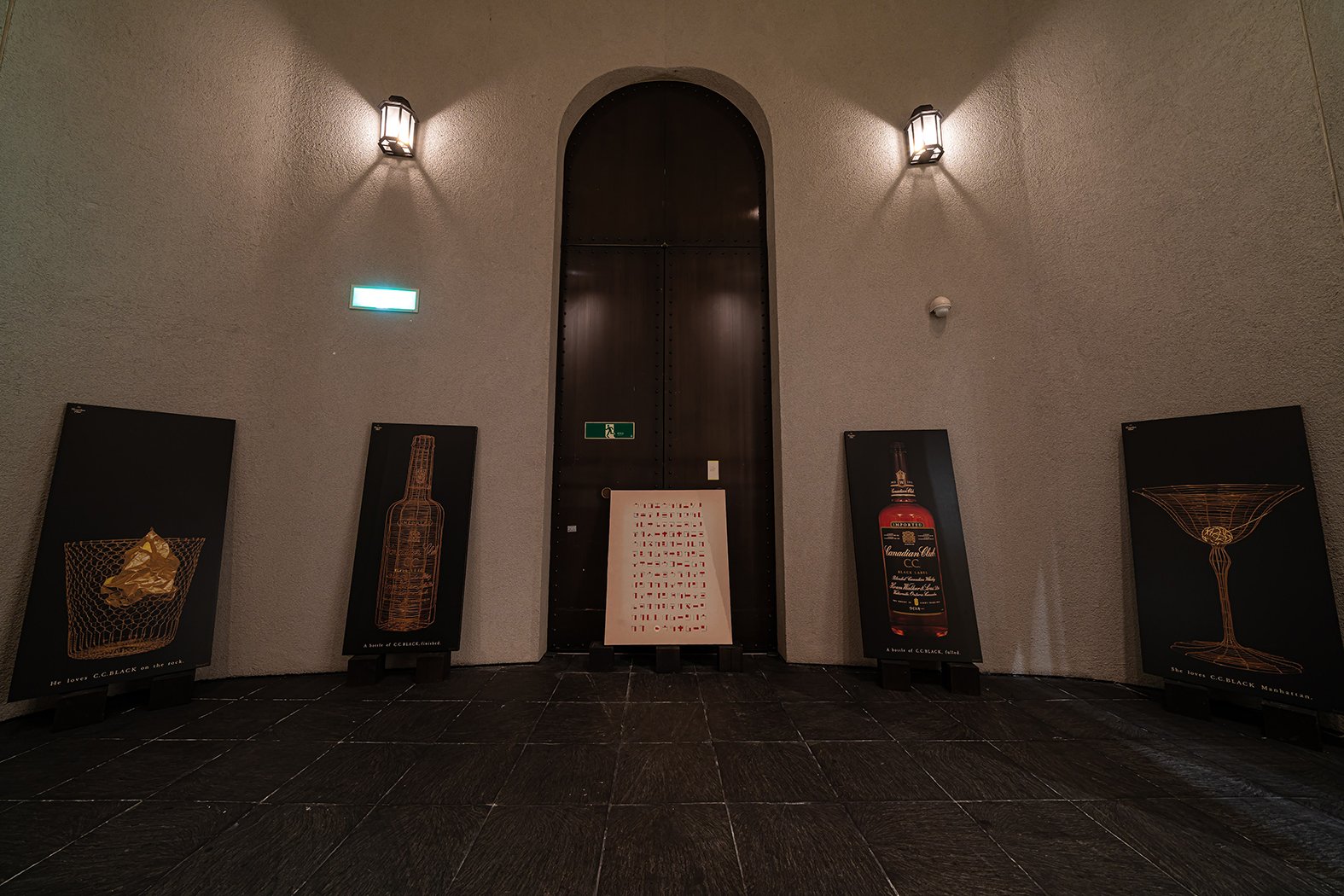
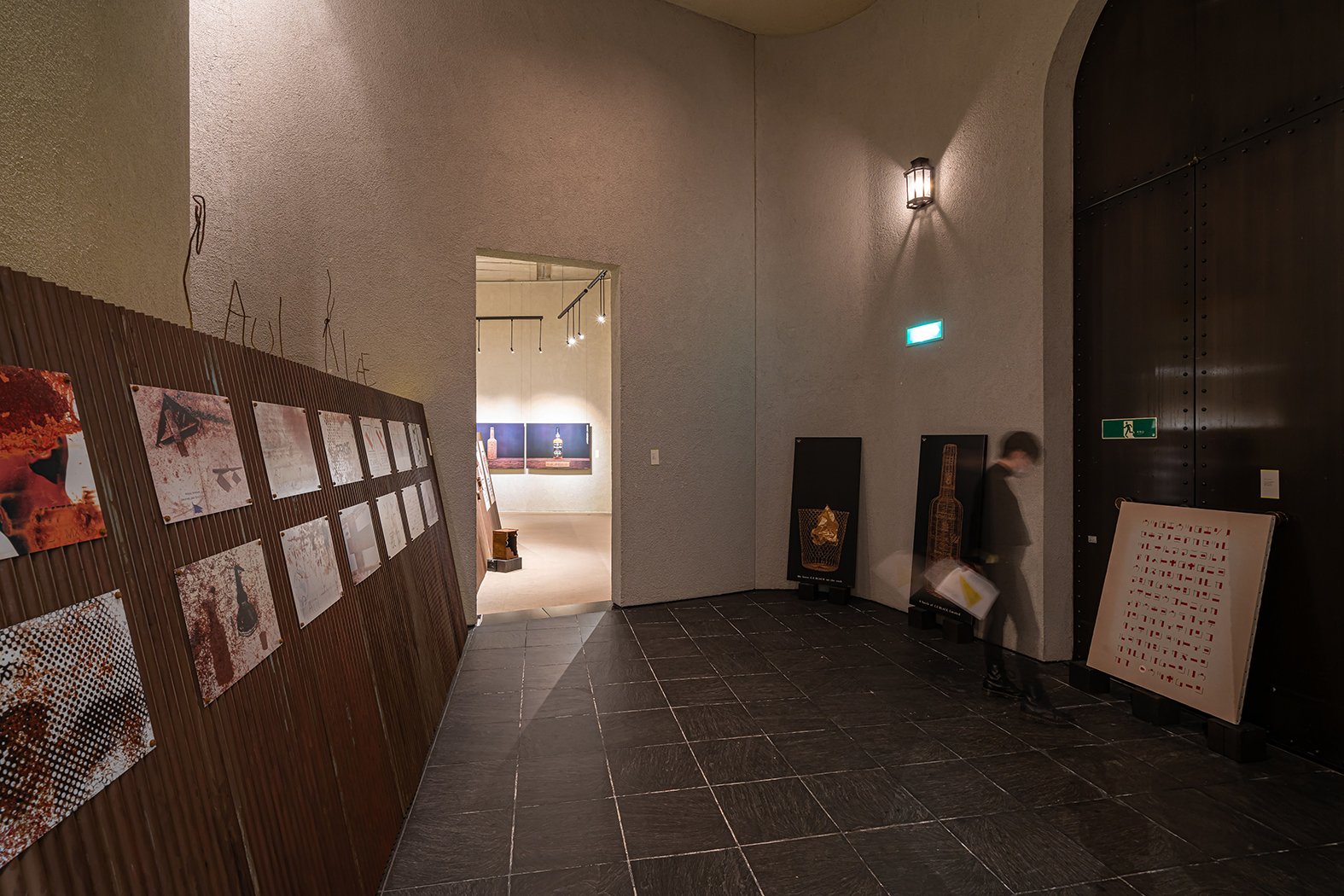
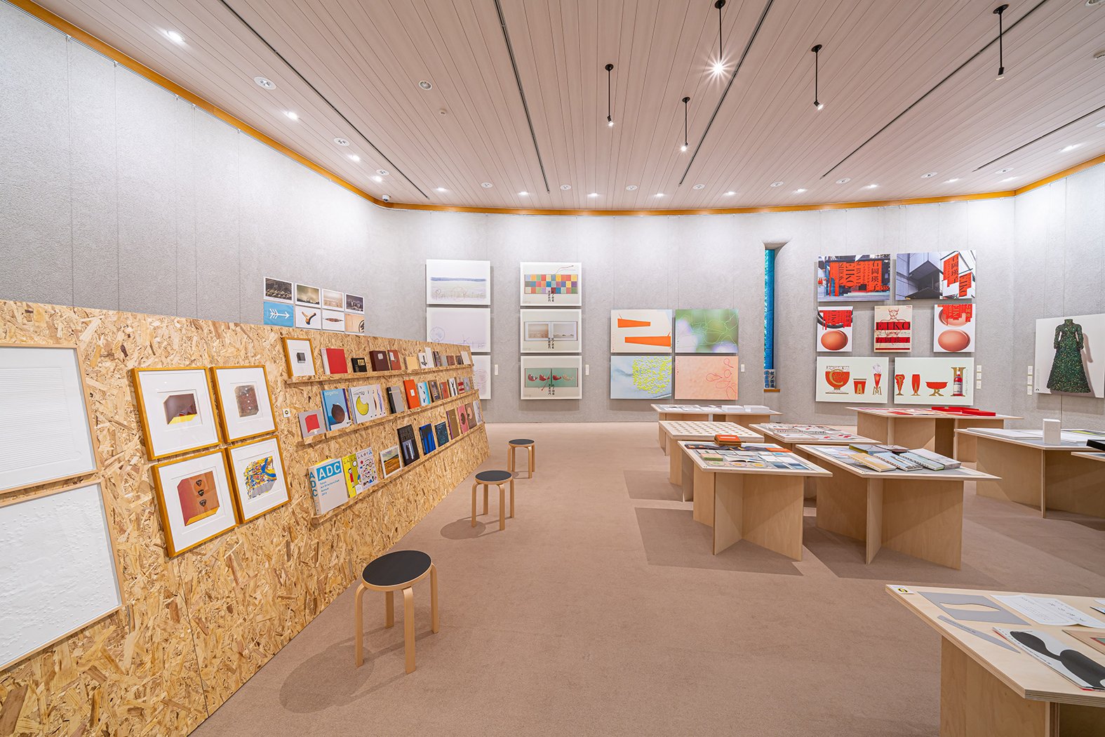
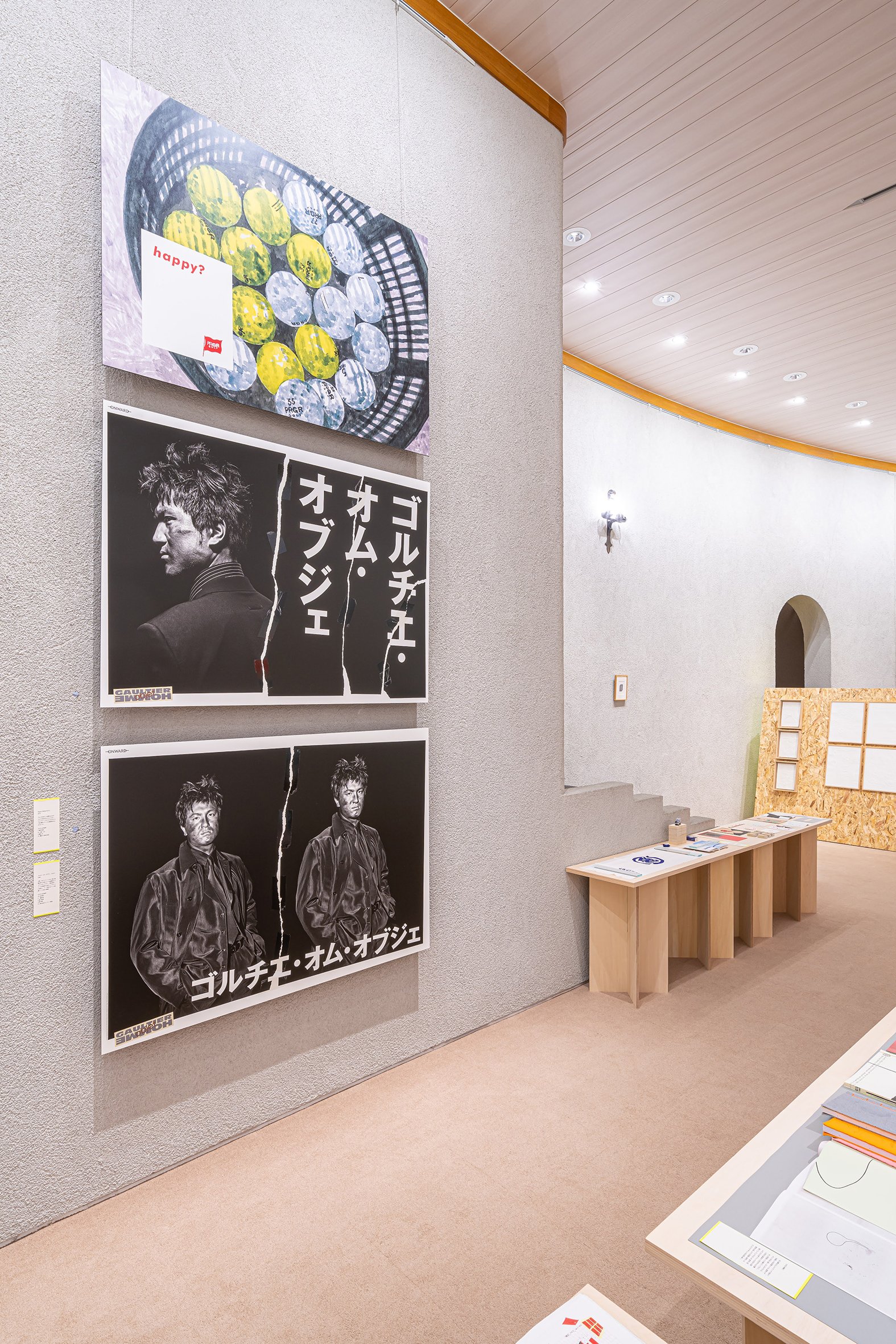
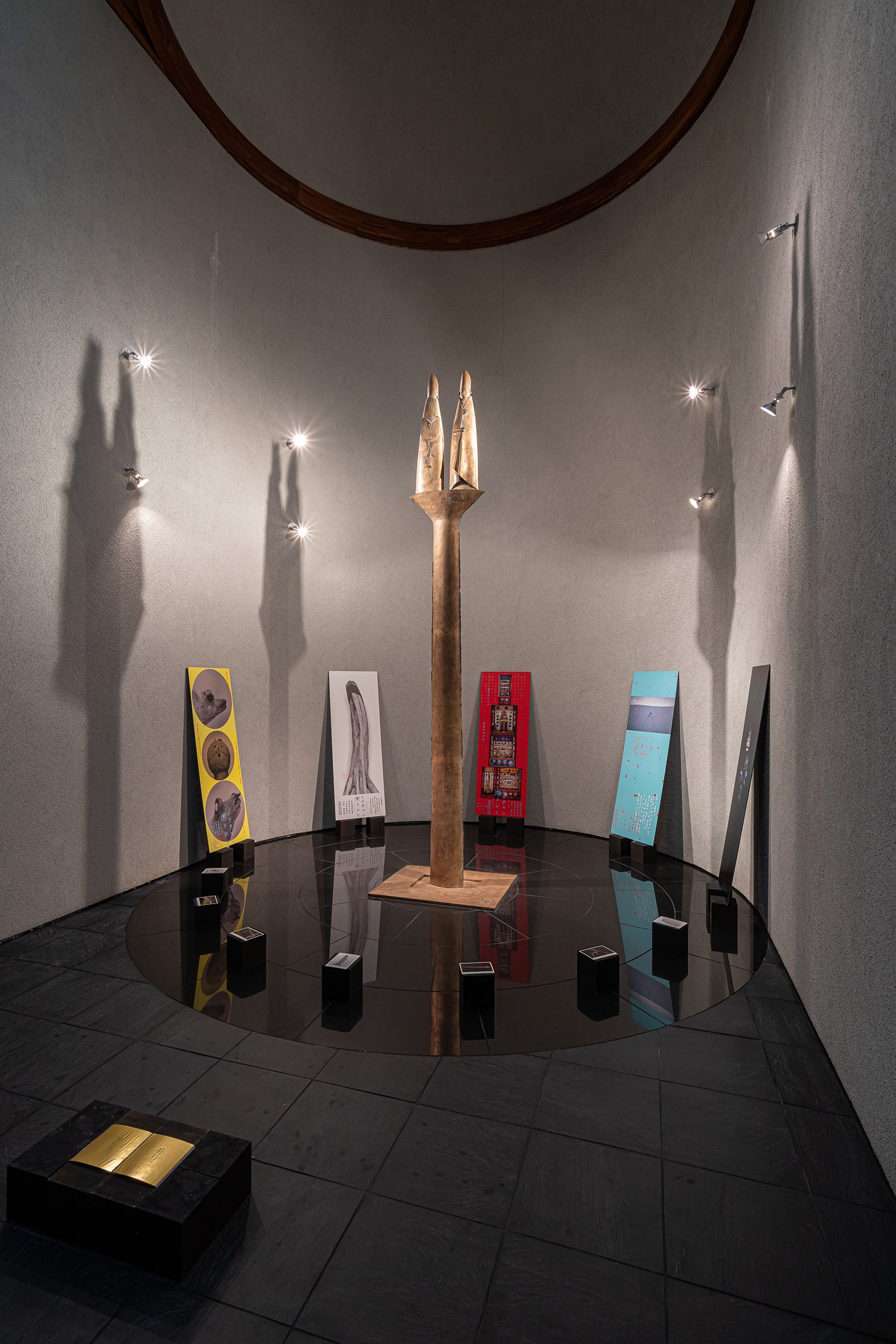
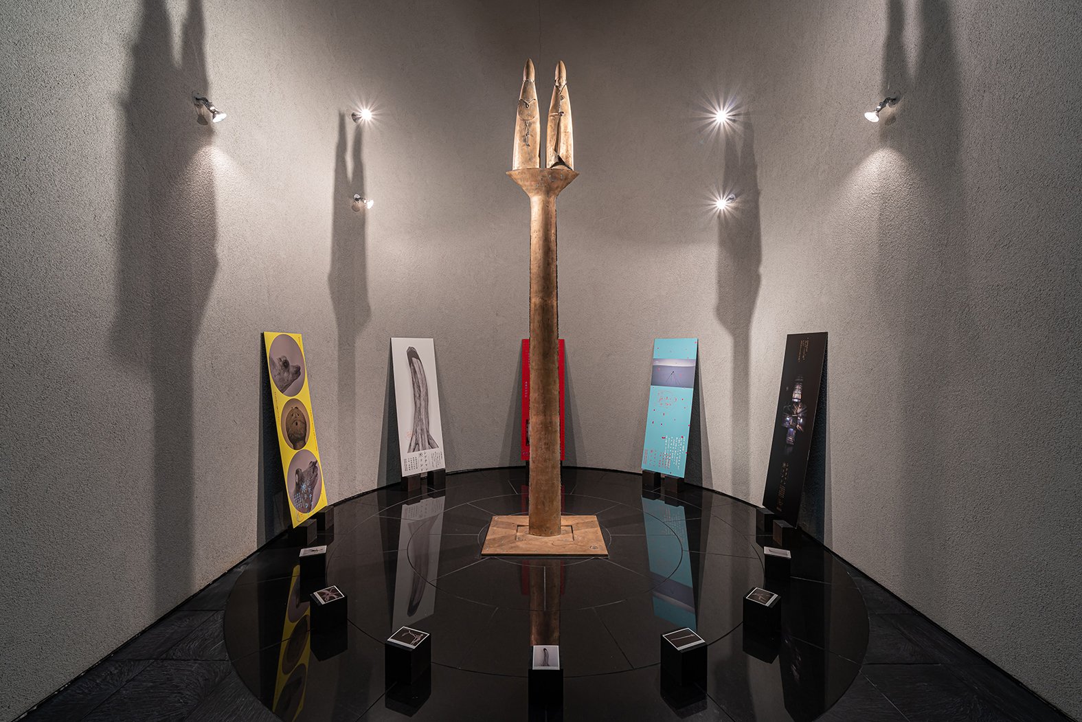
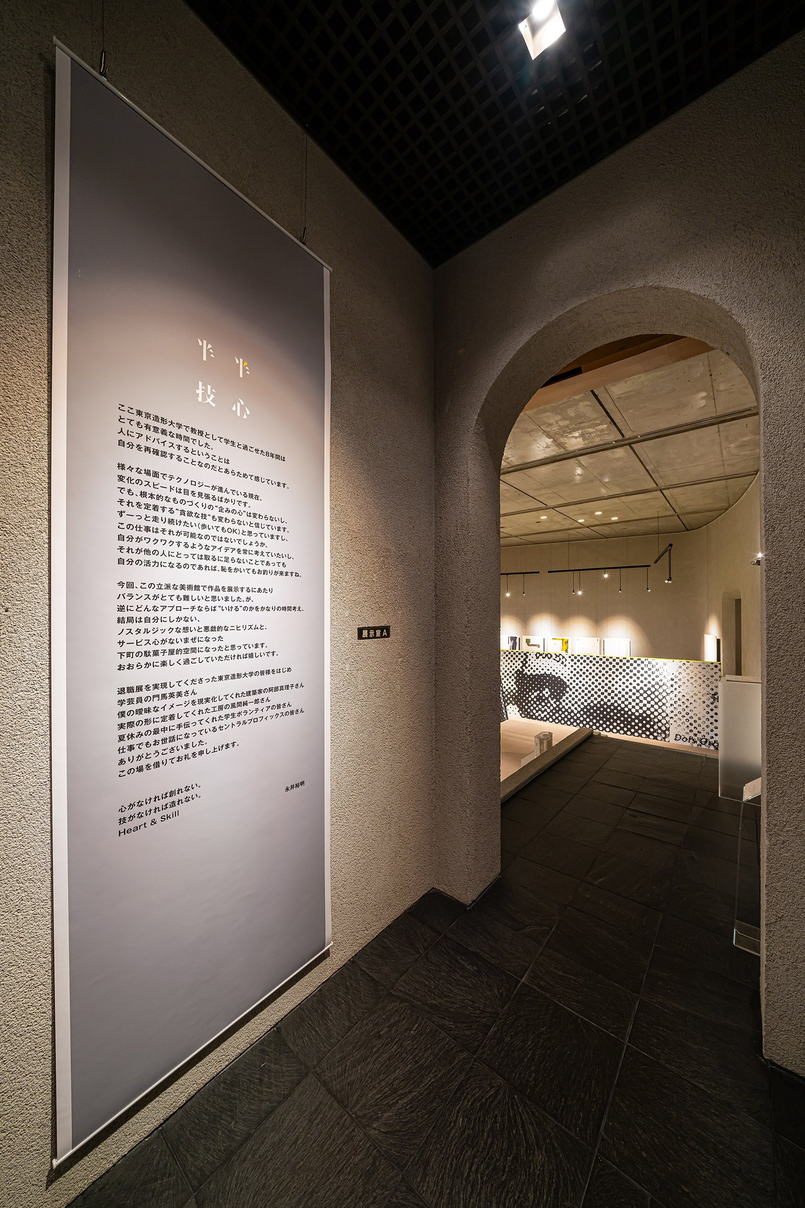
As for the spatial experience, it was a challenge to make some twists to the emptiness and separateness of the existing gallery. The final idea was to place <embankment> as tall as human height in the middle of the space. It added a fresh perspective, and also connected the spaces on the right and left by penetrating the center. The scenery changes as you walk inside and outside. The strait attitude of Nagai's design reflected the way the wall cuts through the pillars and walls.
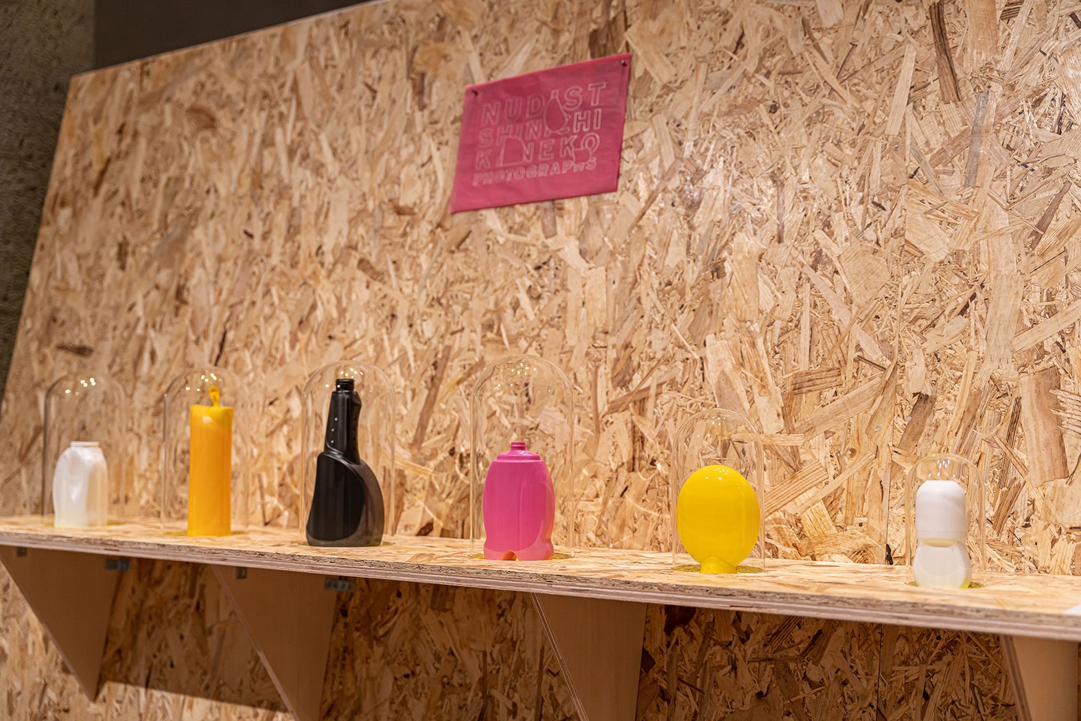
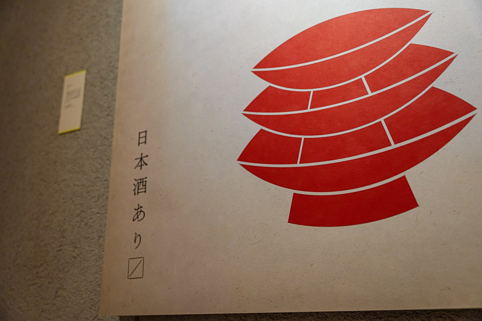
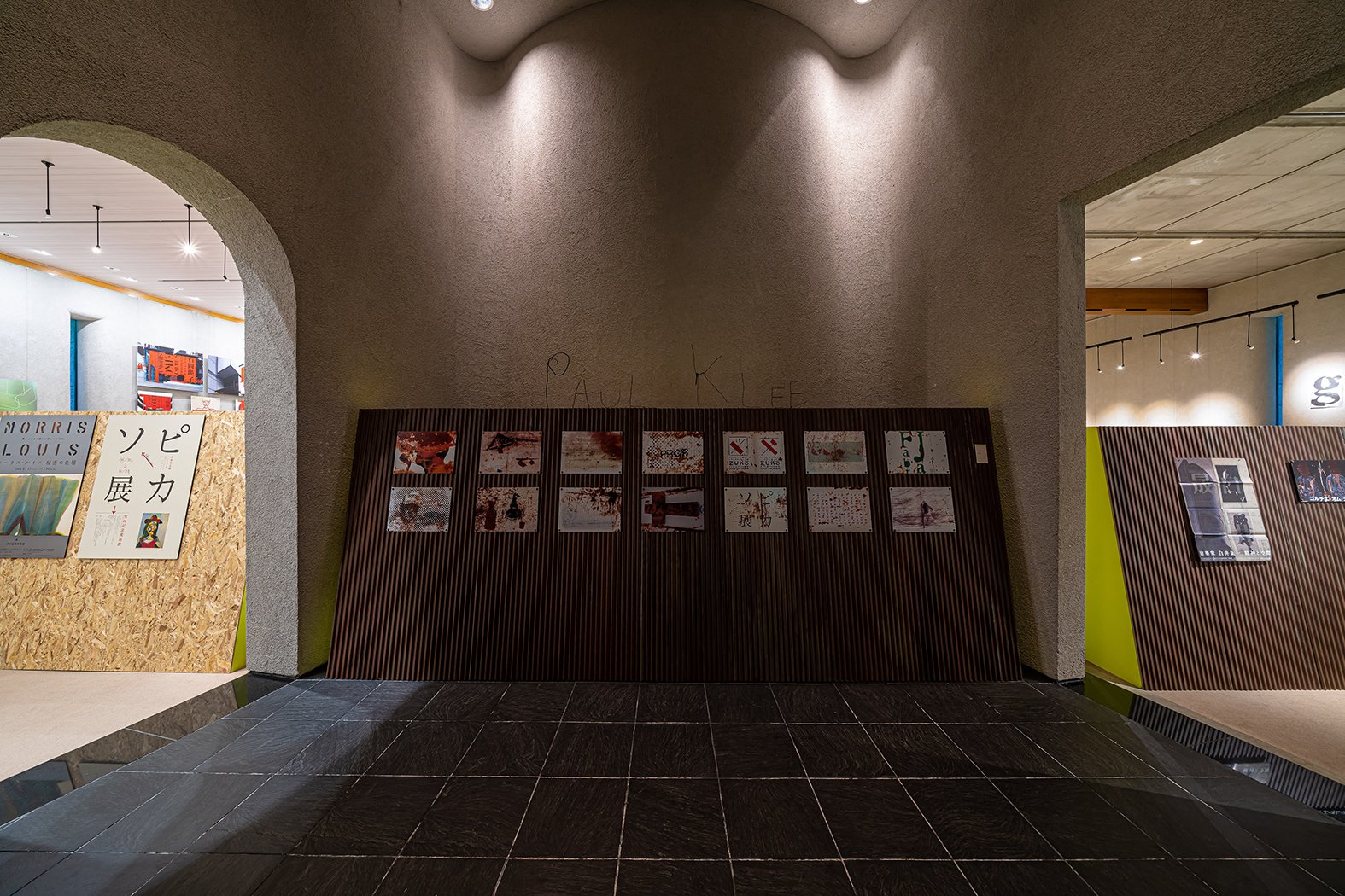
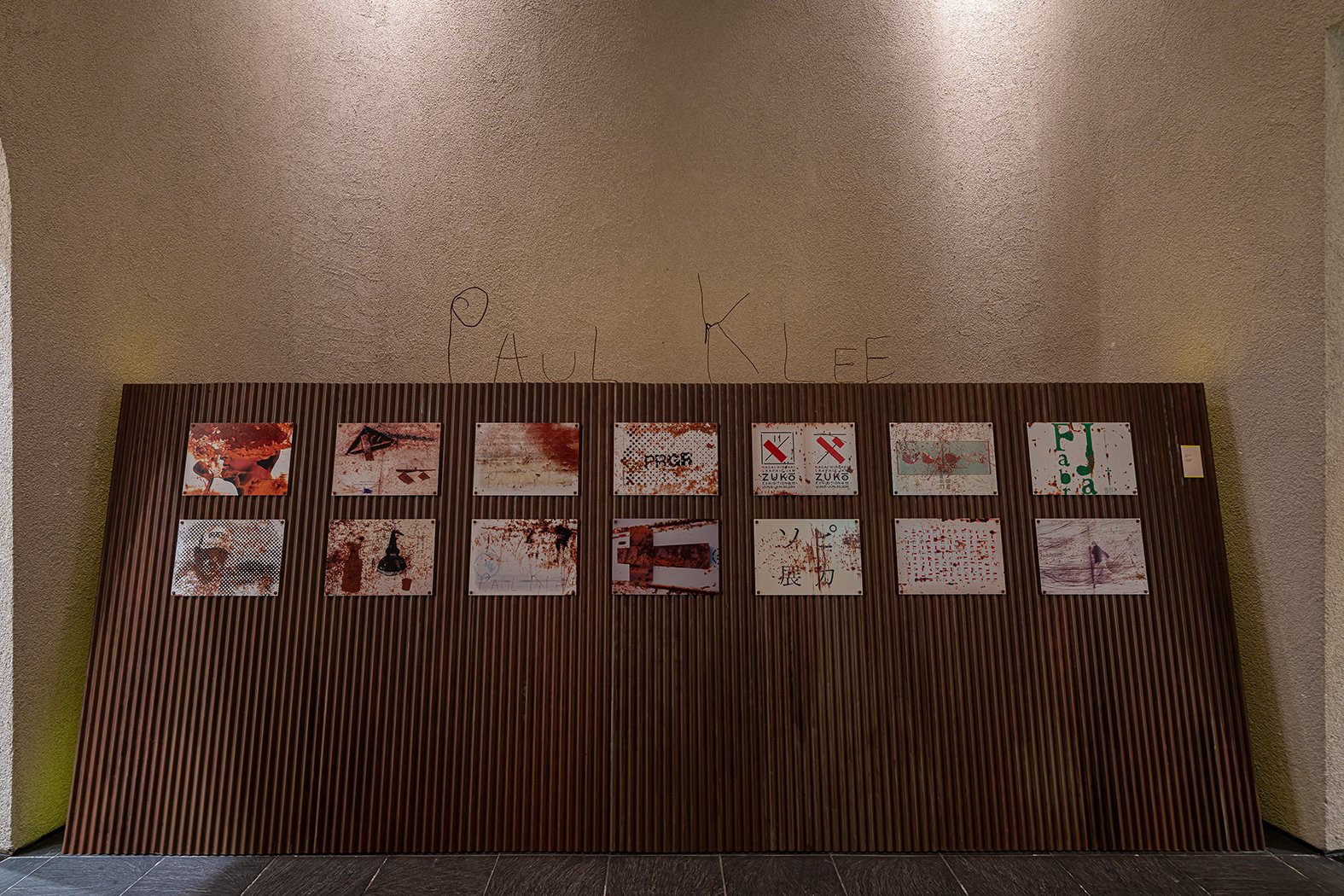
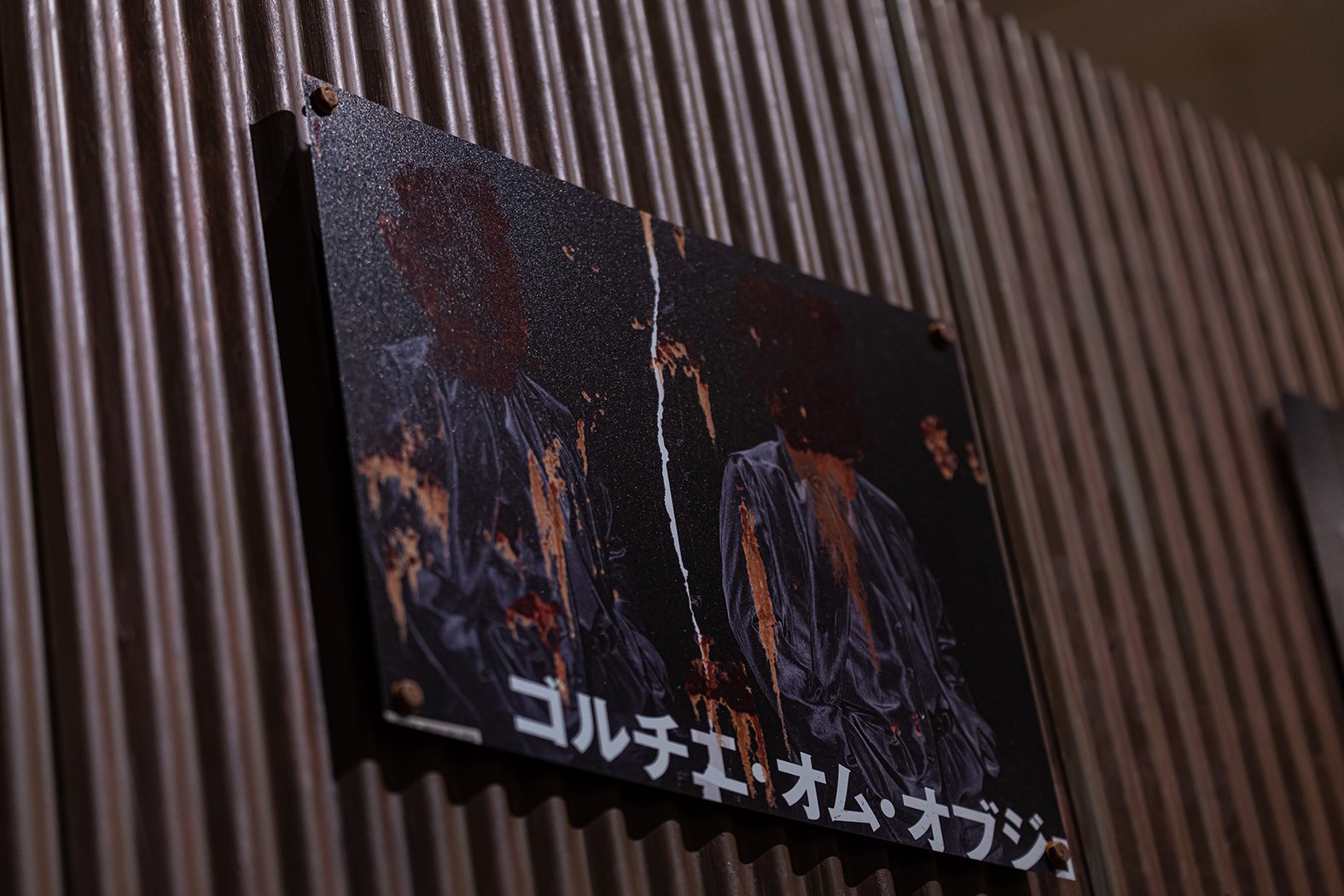
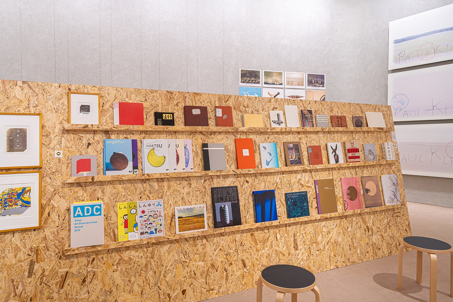
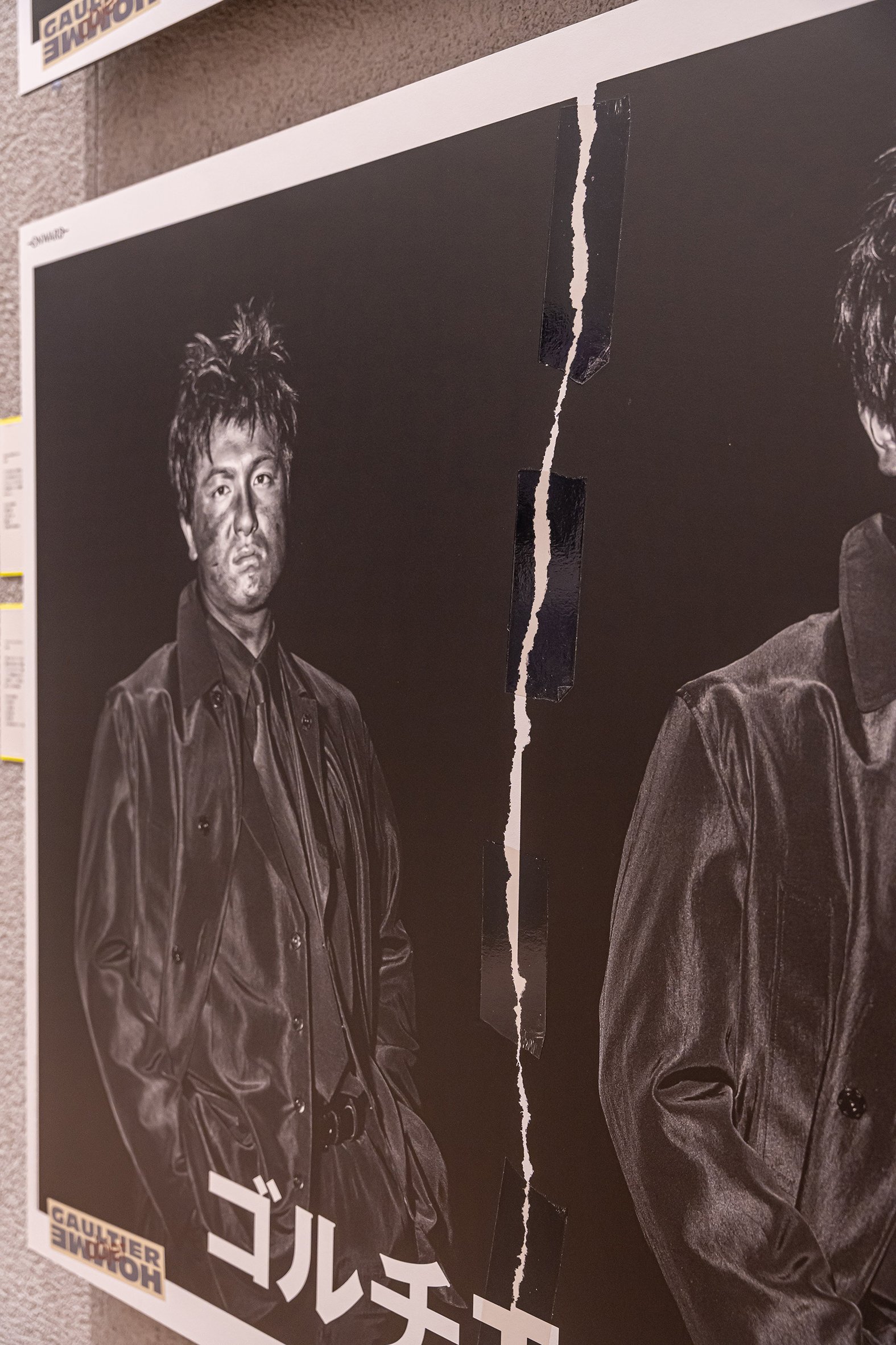
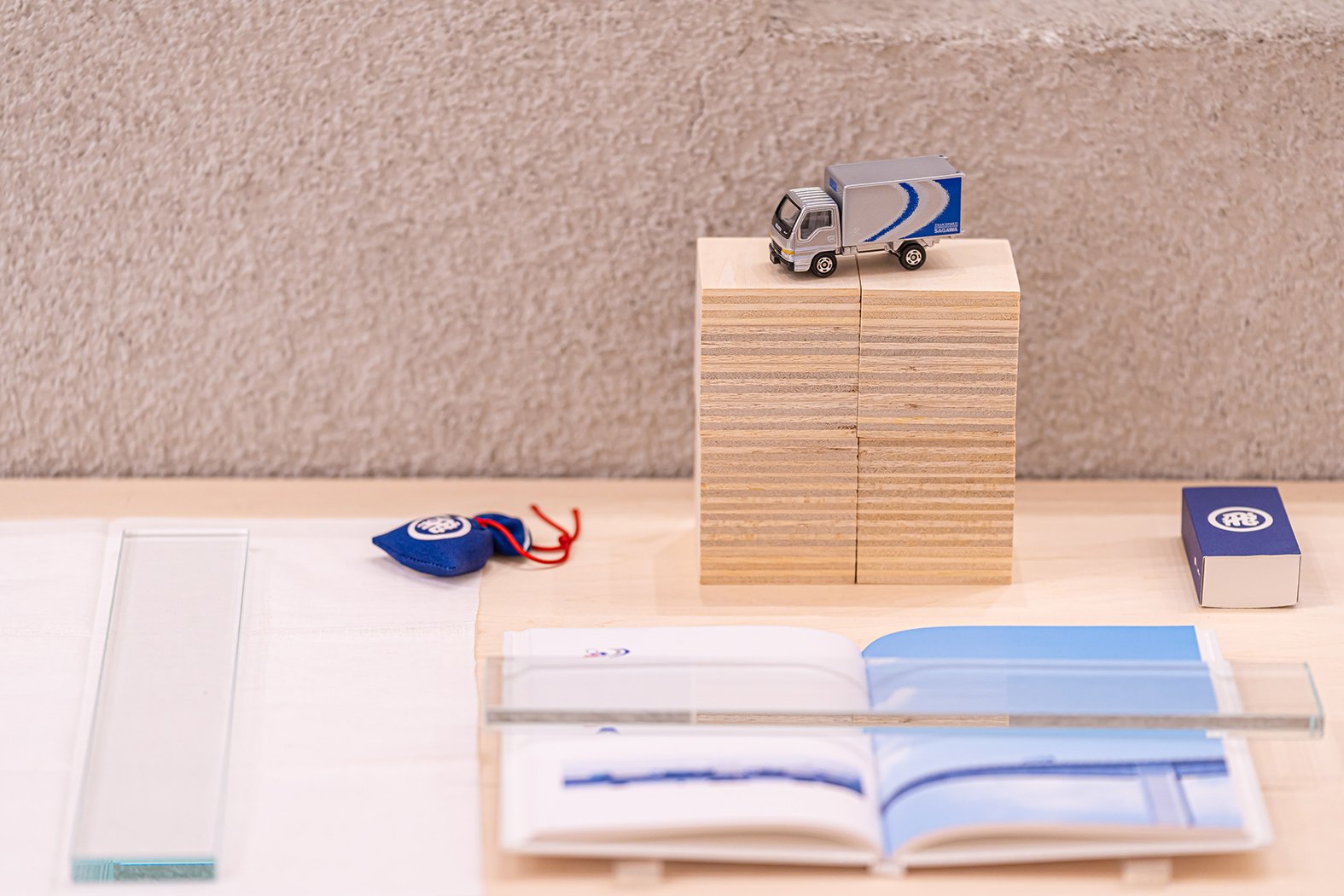
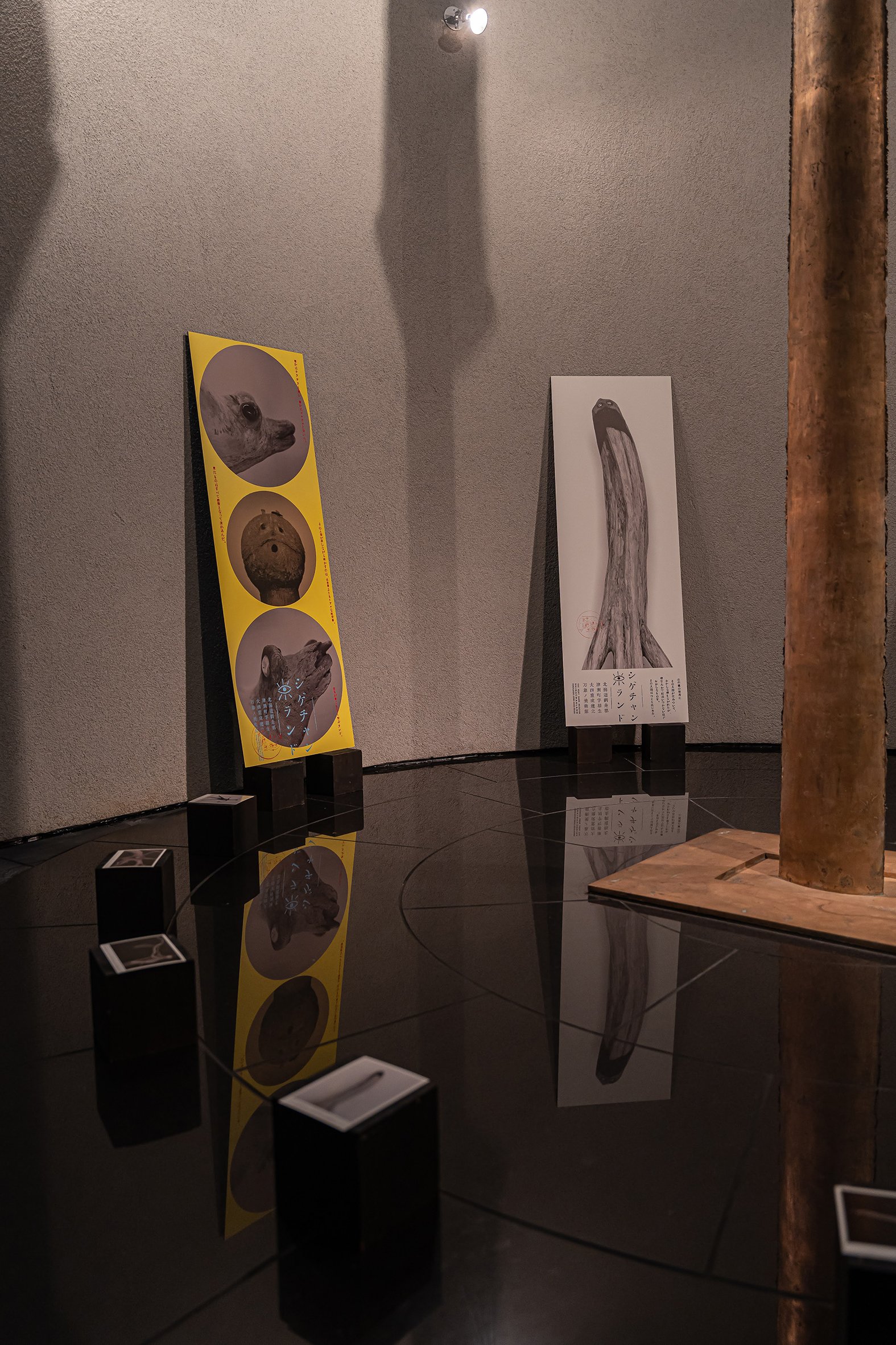
The trapezoidal embankment was designed with OSB boards. The tilted and editable surface let us play with different ingenuity for each project. When looking partially, each method is an extension of what we find in our daily lives. A panel slightly floating from the wall, a bottle stuck in a groove, a poster carefully fastened with magnets, a piece of paper under a book, rusty screws... When gathered and featured, they are legends of simple techniques, and that is, the power of design.
半心半技
アートディレクターの永井裕明さんの展覧会の会場構成。白井晟一が原設計の東京造形大学美術館は、八王子キャンパスの山の上に、シンボリックに佇んでいる。退職記念展として、この特別な場所が会場となった。
永井さんとは、石岡瑛子展でご一緒にお仕事をさせて頂いた。初めてお会いした時、何より模型に夢中になってくれた事が印象に残っている。常に色々な角度からアイディアを出し、実寸実物で検証しながらも、寄り道も拒まず飛び越えていく姿勢が、すごいと思っていた。永井さんのHPの冒頭にボールドに掲載されている、7つのフィロソフィーには、そのデザインの強さの秘密が表れている。
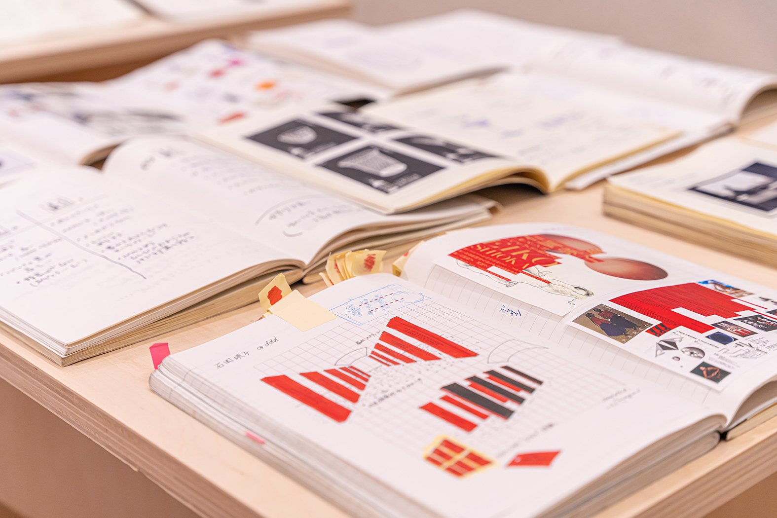
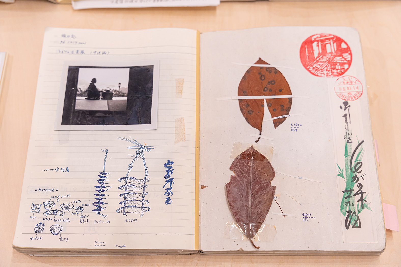
この展示の話を始めたころ、永井さんのデザインには重力や引力・素材感がある、というお話をした。作品に現れる質感、(例えば自然光・ステンシル・針金・砂浜・手の線・キャンバス・錆・ダジャレ)は、印刷物なのに匂いまで伝わるような感覚があり、逆に3次元の迫力なのに平面な驚きすらある。作品の外の製作やロケの疾走感までも想像させる。そしてアトリエや大学の研究に伺うと、”取るに足らない”謎の収集物が多々飾ってあり、目につく物への好奇心が尽きない。
そうして、重力をテーマにしたリアルな展示を発見しようと、何案ご一緒に考えただろうか。ジャコモ・マンズーを前提に設計したの有機的でシンメトリックな空間、モルタルや大理石・ふかふかのカーペットによる静寂の空間にどう挑むか。物を<置く>として、寝せる・落とす・立てかける?<吊る>として、どこで・どう・どの部分?<止める>として、貼る・打ち込む・引っ掛ける?方法から考えてもあらゆるヒントを探し、素材も現地で考えて行った。造形大のキャンパス内には、彫刻科の使う様々な素材が落ちていたり、ワークショップがあり、そういった製作・実験の感じも取り入れたいと話していた。
色々と考えた末に、やはり建築への向き合い方としては、動線や見え方を少し変えたいと思ってしまった。2つの展示室は、壁や床を物で埋めたとしてもガランとしてしまい、入口出口の少し高いレベルから見渡すと少し種明かし感もある。それぞれの展示室が別々にならず、スタートからゴールまで気持ちの途切れない方法を探った。そこで、視界を遮りつつも身長ほどの高さの壁を中央に立て、中央も貫通して右左の空間を繋ぐことを思いついた。その内側外側を歩くことで景色が変わっていく。柱や壁を突っ切るところが、清々しい。
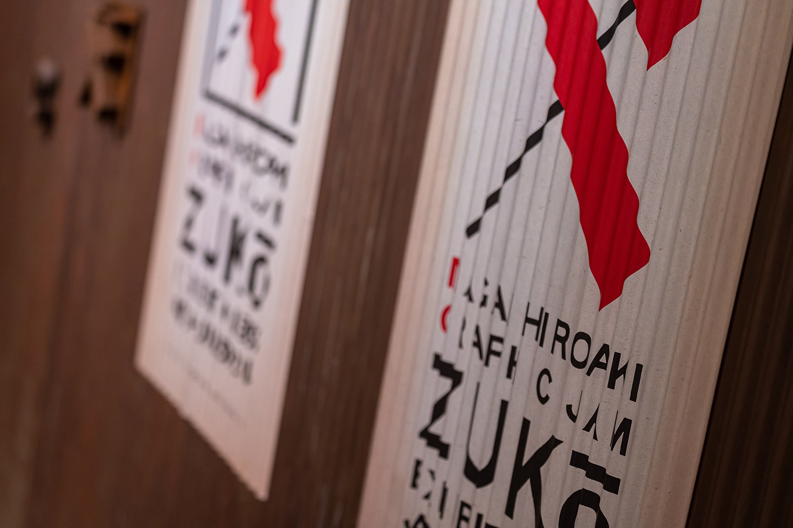
土手や跳び箱のように台形の断面にしたのは、ほぼ永井さんのアイディア。いじり倒してOKの都合よく傾いたOSBの壁と、外側のモルタルの壁を使い、作品ごとに永井さんの工夫が実現されていった。1点でポスターを斜めに吊る重力活用アイディアから、斜め前提の新作が生まれたり、展示の提案と作品が一緒に進んでいく発見ばかりだった。壁から少し浮いたパネルも、溝にはまった瓶も、磁石で留まったポスターも、本の下に敷かれた紙も、錆びたネジも、別々には生活の中で見かける事でも、展示に集まり工夫されると、素朴な技のオールスターだ。